Strategic Graphic Design for Startup Brand Identity Development
Graphic Design in Startups: Building Brand Identity from 0 to 1
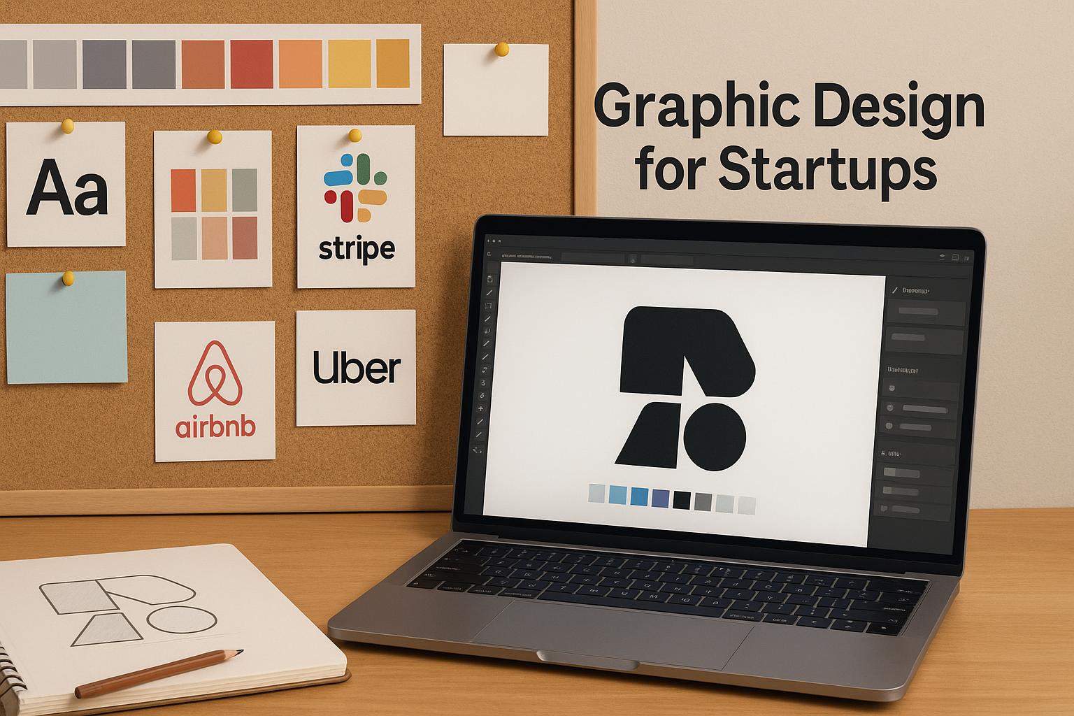
Strategic Role of Graphic Design: Graphic design is a strategic asset for new companies, shaping customer perception from the first encounter. A strong brand aesthetic “resonates with potential customers” and differentiates a startup from competitors (Source: pangea.app. First impressions matter: a well-designed logo and cohesive visual style give startups credibility and trustworthiness, making them look professional and inviting (Source: pangea.app. High-quality design signals reliability; as Pangea notes, “customers tend to associate high-quality design with professionalism”(Source: pangea.app. Consistency across all materials (from websites to business cards) reinforces recognition and brand loyalty over time (Source: pangea.app.

In practice, this means every visual touchpoint should align: the logo, color scheme, and typography all convey the startup’s values. The logo is the brand’s keystone symbol[1] – it “should make a strong first impression” and appear on everything from websites to stationery[2]. The color palette leverages psychology (e.g. red for energy, green for growth) to shape how people feel about the brand[3]. Typography (fonts, spacing, size) also projects personality – for example, serif fonts can feel traditional or trustworthy, while sans-serif fonts feel modern and clean[4]. Many startups start by creating a mood board: a collage of images, textures, and colors that captures the desired look and feel. As one guide emphasizes, “before you start the branding process…you need a mood board to help you create a coherent and distinctive brand identity”[5]. This visual brainstorming ensures that the final logo, color scheme, and fonts all work together.
Developing Brand Identity
Successful brand identity builds on a clear vision. Founders typically refine their brand mission and audience first, then express that mission visually. Start by defining your brand mission, personality, and tone. Next, translate those into concrete design elements. Common practice is to assemble brand elements:
-
Logo: A symbol or wordmark that encapsulates the brand. It should communicate “who you are and the values you set as a brand,” and be memorable[1]. A strong logo appears on every asset and serves as the visual anchor of the brand identity[2].
-
Color Palette: A select set of colors (usually 3–5) that appear across all brand materials. Colors carry meaning (red = passion, blue = calm, etc.)[3]. Choose a primary color for brand recognition and complementary accents for flexibility. Ensure good contrast for readability.
-
Typography: A consistent set of fonts (for headings, body text, etc.) matching the brand voice. Typography is “the visual art of creating written words”[6]. Be deliberate: elegant script fonts convey luxury; clean sans-serifs suggest modernity[7]. Using one or two typefaces consistently makes all materials look unified.
-
Mood Board: A collage of inspiration images, textures, and colors created early on[5]. This helps the team align on the brand’s “visual direction”. It’s a practical tool for narrowing down the aesthetic (e.g. minimal vs. vibrant vs. rustic) before designing actual assets.
The combination of these elements becomes the brand’s visual language. Together they ensure every piece of design (digital or print) feels like part of one cohesive brand. Establishing these identity elements upfront is crucial for positioning: as one branding guide notes, a brand identity’s “multiple components…with three essential elements at its core: the logo, color scheme, and typography”[8].
Visual Storytelling and Brand Voice
A powerful brand goes beyond static images – it tells a story. Visual storytelling means using images, layouts, and design motifs to convey the brand narrative and values[9]. For example, a social app for communities might use photos of people laughing together, warm color tones, and handwritten-style fonts to “narrate a brand’s story through visual content” (e.g. belonging, friendliness)[9]. Visual stories (like photo essays, graphics, or videos) tap into emotions – Harvard research finds ~95% of consumer decisions are subconscious and emotionally driven[10]. Effective visuals build an emotional connection faster than words.
Similarly, the brand voice (tone, language, messaging) must be consistent with the visuals. Brand voice is how a company “sounds” in writing and speech: friendly, authoritative, witty, etc. Together, voice and visuals create a unified brand personality. As Ramotion points out, your “brand voice and tone shape your emotional connections, build trust, and create a consistent identity that your audience can relate to”[11]. For example, a playful startup might use casual language, bright colors, and cartoonish illustrations all in sync, whereas a fintech startup might use formal language, deep blues, and sleek icons for a professional tone. Keeping voice and visuals aligned ensures customers immediately “get” what the brand stands for.
Designing Digital Assets
Once the core identity is set, it’s time to apply it across digital channels. Every digital asset – from your website UI to social posts – should reflect the brand style guide. Website/ UI Design: The website is often the first deep interaction. Its look and usability must match the brand. According to UXPin, “UX design has a significant impact on brand consistency”: the site’s color scheme, typography, imagery, and even button shapes should mirror the brand identity, creating a “strong first impression” and seamless experience[12]. Key pages (homepage, about, product pages) should clearly use the brand logo, palette, and fonts. Navigation and layout should feel intuitive and on-brand. If a founder redesigns the site, they should A/B test it – as one case showed, an optimized redesign can lift metrics (e.g. a B2B SaaS saw 46.3% more account signups after a redesign)[13].
Social Media Kits: Social media demands consistent branding on multiple platforms. A social media kit is a set of templates and assets (profile banners, post graphics, story templates) that use the brand’s logo, colors, and fonts. This ensures that every tweet, Instagram post, or Facebook ad is immediately recognizable as coming from your brand. As one resource explains, a social media kit “is a collection of all of your business’s visuals…brand identity standards, and other critical materials required to have a strong presence across many social media platforms”[14]. Building templates in advance saves time and maintains consistency as different team members create content.
Email Templates and Pitch Decks: Similarly, email newsletters and pitch presentations should follow brand guidelines. An email template with your logo, header graphics, and brand fonts makes every campaign look professional and familiar to subscribers. Pitch decks for investors should also use branded slides – cohesive visuals help tell the startup story clearly. Investors often expect polished slides: consistent colors, readable fonts, and well-designed charts reinforce confidence in the business. (While we didn’t find a source specifically on decks, it’s common design advice: "a strong, on-brand pitch deck can make your startup memorable to investors".)
Print and Physical Branding
Even in a digital-first world, physical print materials and packaging matter for startups that interact offline. Business Cards and Stationery: A startup’s business cards, letterhead, and envelopes carry the same visual identity. On a card, a clean design with logo, name, and minimal contact info can leave a strong impression. Even if meeting in person is rare, having polished cards or flyers at events shows professionalism.
Packaging and Collateral: For product startups, packaging is the first tangible brand touchpoint for customers. Packaging design should convey the brand message and stand out on shelves or at delivery. As branding expert Michael Dillon notes, “Packaging is a customer-facing extension of a company’s brand. It conveys important messages about the company and how it wants to be perceived”, and a well-designed package can make a product “stand out…leave a lasting impression”[15]. This is true for boxes, labels, or even product manuals. Similarly, brochures, flyers, and posters for marketing should all use the logo, colors, and fonts. The goal is that any physical item someone receives or sees will immediately feel like part of the brand.
By covering both digital and print, startups ensure that no matter where customers encounter them, the visual experience is unified. Consistency across mediums reinforces the brand position and makes the company look cohesive and reliable.
Design Systems and Scalability
As the startup grows, it’s important to scale the design workflow. Early on, a startup might have one person making ad-hoc graphics. But soon, multiple team members or outside contractors may create materials. A design system (or comprehensive style guide) is the solution for scalability. A design system typically includes guidelines on logo usage, color codes, typography rules, iconography, and ready-to-use component designs or templates. As one resource explains, a design system – which “includes a style guide” – is “an essential resource for a brand that wants to bring stability, consistency and scalability to its omnichannel customer experience and visual strategy”[16]. In practice, this means documenting every design rule so anyone (designer or developer) can quickly produce on-brand materials.
For example, a company might have a living online style guide showing the exact brand colors (with hex codes), approved logos (in various layouts), font files, and example layouts. Every new brochure, web page, or ad is then checked against this guide. This prevents inconsistencies like a rogue green that doesn’t match the brand or a distorted logo. It also speeds up the process: designers reuse components (buttons, icons, patterns) rather than building from scratch. A robust design system can even include coded UI components (in Figma or as part of the web code) so that developers build features that look exactly like the design specs. This approach ensures that as the company scales – adding new products or campaigns – the brand appearance remains coherent[16][17].
Tools and Hiring Options
Design Tools: Startups should pick design tools that fit their needs and budget. There are broadly three categories: professional suites, collaborative design platforms, and easy template-based tools. Adobe Creative Cloud (Illustrator, Photoshop, InDesign) is the industry standard for complex, print-ready graphics and photo editing[18]. It offers precision (vector scaling, advanced typography) but comes with steep learning curves and subscription costs. Figma has become a startup favorite for UI and collaborative design[19]. It’s cloud-based, so multiple people can work together in real time from anywhere, and it supports interfaces, icons, and illustrations[19]. For non-designers or rapid content creation, Canva (including Canva Pro) provides easy drag-and-drop templates for social graphics, flyers, and presentations[20]. It’s user-friendly and cost-effective, though less flexible for highly custom art. In summary: use Figma (or Sketch) for product/UI design and teamwork[19], Adobe tools for professional graphics and print materials[18], and Canva for quick marketing assets.
Hiring vs. DIY: Many startups must decide whether to hire help. Early on, a founder might do design themselves or use freelancers. Freelancers can be very cost-effective when on a tight budget: “Freelancers charge lower rates” than agencies and can optimize workflow with the in-house team[21]. However, freelancers work alone; if they’re unavailable or lack a needed skill (say website UX), the project stalls. Alternatively, hiring a design agency brings a whole team. Agencies can offer more capacity, skill variety, and strategic insight (brand agencies often do market research and broader planning)[22][23]. They tend to work efficiently like a “well-oiled machine”[23], saving time on project management. The trade-off is cost: agencies charge more overall, so they are best when substantial branding work or a re-launch is needed. In short, use freelancers or tools when budgets are tiny, but consider a professional agency or in-house designer when the brand’s visual quality is mission-critical.
Case Studies: Design Driving Growth
Real startup stories underscore how design choices impact growth. - Airbnb: In its early days (at <$1,000/month revenue), co-founder Joe Gebbia realized poor-quality listing photos were hurting bookings. He and his team invested in professional photography for a few properties. Overnight, those listings’ earnings doubled[24]. This insight into visual appeal helped Airbnb scale to a multi-billion dollar brand (now valued ~$24B). The lesson: high-quality imagery aligned with brand story (“belong anywhere”) directly boosted bookings.
-
Optimizely: A/B testing a website redesign gave dramatic results. After designing a new UI, Optimizely tested it against their old site and saw 46.3% more user accounts created with the new design[13]. They adopted the redesign company-wide. In other words, better design translated into tangible customer acquisition.
-
Harry’s Razors: To break into a Gillette-dominated market, Harry’s invested heavily in branding and product design. They introduced a clean, minimalist aesthetic, sleek ergonomics, and a friendly brand voice. This approach paid off: about 90% of customers reorder, a retention rate far above industry norms[25]. The brand’s “beautiful branding” and quality packaging turned a commodity into a desirable product[25].
-
Netflix: In 2011, Netflix revamped its user interface (the “Density” redesign) despite vocal user complaints. They A/B tested the new design and found user engagement actually increased[26]. The data trumped anecdotal feedback, and Netflix kept the redesign. This showed that thoughtful redesign – even if initially unpopular – can measurably improve usage when backed by data.
These examples highlight a common theme: iterating design yields growth. Airbnb’s photo shoot, Optimizely’s UI tests, Harry’s branding, and Netflix’s redesign all led to clear gains. They demonstrate that design isn’t just decoration – it’s a driver of user trust, engagement, and conversion. (Other companies likewise credit their brands: Canva, Slack, and Dropbox famously focused on user-friendly, on-brand interfaces to win customers.) In short, measured investments in design can produce outsized returns for startups[24][13].
Common Mistakes to Avoid and Best Practices
Avoiding pitfalls is as important as following guidelines. Based on branding experts, common startup design mistakes include:
-
Inconsistent branding: Using different logos, colors, or fonts across channels confuses customers. “Consistency in branding fosters trust… Companies with inconsistent branding appear unprofessional and disjointed,” warns Pitchdrive[17]. Mistake example: a social post in purple when the logo is green. Best practice: Create and follow a style guide so every asset – online or offline – uses the same palette, logo, and typography[17].
-
Chasing every trend: Many startups try to copy the latest design fads, but trends “can make your brand look dated quickly”[27]. For example, a logo with an ultra-modern fad font might need reworking later. Best practice: Use trends sparingly as inspiration; keep core elements (logo concept, brand color) timeless and anchored in your mission[27][28].
-
Poor visual quality: Amateurish or low-resolution graphics undermine credibility. TMDesign notes that a “disorganized or amateurish brand identity” makes a company seem “less reliable or trustworthy”[29]. For instance, a business card with a blurry logo sends the wrong message. Best practice: Use high-resolution assets and professional layouts. If needed, hire a designer for key pieces (like the logo) to ensure polish.
-
Overcomplicating the brand: Trying to do too much – too many messages, colors, or styles – dilutes impact. “Startups often make the mistake of trying to be too many things to too many people”[30], which confuses customers. Best practice: Focus your brand on a few core ideas (your mission and primary audience) and express those simply. A clear, consistent brand narrative wins over a confusing multi-headed one.
-
Ignoring the target audience: Branding aimed at “everyone” resonates with no one. As TMDesign warns, companies must understand and target their specific audience or risk misaligned design[31]. Best practice: Do market research to know your customer’s tastes and needs. Then design visuals and messages that speak directly to that group.
In general, the best practices are: research first, then design, and maintain consistency. Develop a basic style guide early (even a simple document of rules) to stay aligned[17]. Keep designs simple, clear, and on-brand, rather than cluttered. Continuously test and iterate: use A/B testing (as Netflix and Optimizely did[13][26]) to validate that design changes improve real metrics. Finally, remember branding is a journey. As the startup scales, revisit and refine the identity (with fresh design help) to stay relevant, but always keep the core mission and values at heart. When done right, graphic design becomes a pillar of product success, not just decoration[12][16].
Sources: Insights are drawn from branding and design experts, including industry blogs and case studies (Source: pangea.app(Source: pangea.app[1][14][15][16][18][21][24][17][29], illustrating how strategic design underpins startup growth.
External Sources
About Tapflare
Tapflare in a nutshell Tapflare is a subscription-based “scale-as-a-service” platform that hands companies an on-demand creative and web team for a flat monthly fee that starts at $649. Instead of juggling freelancers or hiring in-house staff, subscribers are paired with a dedicated Tapflare project manager (PM) who orchestrates a bench of senior-level graphic designers and front-end developers on the client’s behalf. The result is agency-grade output with same-day turnaround on most tasks, delivered through a single, streamlined portal.
How the service works
- Submit a request. Clients describe the task—anything from a logo refresh to a full site rebuild—directly inside Tapflare’s web portal. Built-in AI assists with creative briefs to speed up kickoff.
- PM triage. The dedicated PM assigns a specialist (e.g., a motion-graphics designer or React developer) who’s already vetted for senior-level expertise.
- Production. Designer or developer logs up to two or four hours of focused work per business day, depending on the plan level, often shipping same-day drafts.
- Internal QA. The PM reviews the deliverable for quality and brand consistency before the client ever sees it.
- Delivery & iteration. Finished assets (including source files and dev hand-off packages) arrive via the portal. Unlimited revisions are included—projects queue one at a time, so edits never eat into another ticket’s time.
What Tapflare can create
- Graphic design: brand identities, presentation decks, social media and ad creatives, infographics, packaging, custom illustration, motion graphics, and more.
- Web & app front-end: converting Figma mock-ups to no-code builders, HTML/CSS, or fully custom code; landing pages and marketing sites; plugin and low-code integrations.
- AI-accelerated assets (Premium tier): self-serve brand-trained image generation, copywriting via advanced LLMs, and developer tools like Cursor Pro for faster commits.
The Tapflare portal Beyond ticket submission, the portal lets teams:
- Manage multiple brands under one login, ideal for agencies or holding companies.
- Chat in-thread with the PM or approve work from email notifications.
- Add unlimited collaborators at no extra cost.
A live status dashboard and 24/7 client support keep stakeholders in the loop, while a 15-day money-back guarantee removes onboarding risk.
Pricing & plan ladder
| Plan | Monthly rate | Daily hands-on time | Inclusions |
|---|---|---|---|
| Lite | $649 | 2 hrs design | Full graphic-design catalog |
| Pro | $899 | 2 hrs design + dev | Adds web development capacity |
| Premium | $1,499 | 4 hrs design + dev | Doubles output and unlocks Tapflare AI suite |
All tiers include:
- Senior-level specialists under one roof
- Dedicated PM & unlimited revisions
- Same-day or next-day average turnaround (0–2 days on Premium)
- Unlimited brand workspaces and users
- 24/7 support and cancel-any-time policy with a 15-day full-refund window.
What sets Tapflare apart
Fully managed, not self-serve. Many flat-rate design subscriptions expect the customer to coordinate with designers directly. Tapflare inserts a seasoned PM layer so clients spend minutes, not hours, shepherding projects.
Specialists over generalists. Fewer than 0.1 % of applicants make Tapflare’s roster; most pros boast a decade of niche experience in UI/UX, animation, branding, or front-end frameworks.
Transparent output. Instead of vague “one request at a time,” hours are concrete: 2 or 4 per business day, making capacity predictable and scalable by simply adding subscriptions.
Ethical outsourcing. Designers, developers, and PMs are full-time employees paid fair wages, yielding <1 % staff turnover and consistent quality over time.
AI-enhanced efficiency. Tapflare Premium layers proprietary AI on top of human talent—brand-specific image & copy generation plus dev acceleration tools—without replacing the senior designers behind each deliverable.
Ideal use cases
- SaaS & tech startups launching or iterating on product sites and dashboards.
- Agencies needing white-label overflow capacity without new headcount.
- E-commerce brands looking for fresh ad creative and conversion-focused landing pages.
- Marketing teams that want motion graphics, presentations, and social content at scale. Tapflare already supports 150 + growth-minded companies including Proqio, Cirra AI, VBO Tickets, and Houseblend, each citing significant speed-to-launch and cost-savings wins.
The bottom line Tapflare marries the reliability of an in-house creative department with the elasticity of SaaS pricing. For a predictable monthly fee, subscribers tap into senior specialists, project-managed workflows, and generative-AI accelerants that together produce agency-quality design and front-end code in hours—not weeks—without hidden costs or long-term contracts. Whether you need a single brand reboot or ongoing multi-channel creative, Tapflare’s flat-rate model keeps budgets flat while letting creative ambitions flare.
DISCLAIMER
This document is provided for informational purposes only. No representations or warranties are made regarding the accuracy, completeness, or reliability of its contents. Any use of this information is at your own risk. Tapflare shall not be liable for any damages arising from the use of this document. This content may include material generated with assistance from artificial intelligence tools, which may contain errors or inaccuracies. Readers should verify critical information independently. All product names, trademarks, and registered trademarks mentioned are property of their respective owners and are used for identification purposes only. Use of these names does not imply endorsement. This document does not constitute professional or legal advice. For specific guidance related to your needs, please consult qualified professionals.