Startup Failure: The Cost of Poor UX & Design in Product Launch
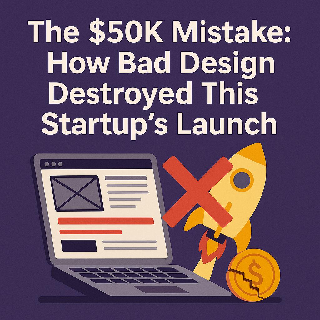
The $50K Mistake: How Bad Design Destroyed This Startup’s Launch
Introduction: Design as a Startup’s Make-or-Break Factor
In the startup world, design isn’t just about pretty visuals – it can spell the difference between explosive growth and a catastrophic flop. A recent cautionary tale illustrates this point all too well: a promising new app startup poured roughly $50,000 into its product development and launch marketing, only to see the entire investment go up in smoke due to poor design choices. The founders had a groundbreaking idea and solid engineering, but they ignored core design principles in UI/UX and branding. The result? Confused users, abysmal engagement, and a speedy collapse of what should have been a successful launch. Unfortunately, this scenario is far from rare – studies show that 17% of startup failures are caused by a user-unfriendly product (bad user experience), and 42% of failures stem from not meeting market needs(Source: leadership.ng, issues often tied to poor UX and lack of user research. In this in-depth analysis, we will unpack how bad design decisions led to such dire business outcomes for this fictional startup, examine real-world examples where design made or broke companies, and extract expert insights on how to avoid making the same $50K mistake.
The Startup’s $50K Design Mistake: A Narrative
Let’s call our ill-fated startup DevMate (a fictional but realistic example). DevMate was supposed to be a productivity app that would streamline task management for tech teams. The founders secured a small seed fund and personal savings totaling $50,000 – enough to design, build, and promote an MVP (Minimum Viable Product) for launch. They were eager to make a splash in the market and decided to fast-track development, skimp on user research, and “polish” the product with flashy design elements they assumed users would love. The app’s interface was packed with features and stylish graphics, and the branding team chose an edgy logo and slogan. On the surface, everything looked set for a big launch.
However, hidden beneath the shiny veneer were fatal design flaws. DevMate’s UI was cluttered and confusing, lacking any clear hierarchy or guidance. New users who downloaded the app faced an immediate onslaught of menu options and blinking widgets with virtually no onboarding tutorial. Basic tasks like creating a project or adding teammates were buried under layers of unfriendly icons. During the frenzied pre-launch rush, the team had skipped usability testing and user feedback cycles entirely – they were convinced their design was intuitive because it made sense to them. This proved to be a grave mistake: “User experience cannot exist without users… Even the most well thought out designs are assumptions until tested by real users. Leaving the user out is not an option.” as one Nielsen Norman Group expert warns[1]. By failing to include target users in the design process, DevMate’s team fell into the trap of designing for themselves rather than the customer, a classic startup error.
Launch day turned into a nightmare. Thanks to an aggressive ad campaign, a wave of curious users downloaded DevMate – only to be immediately frustrated. The visual design was slick but not functional: navigation buttons lacked labels, the color scheme offered low contrast, and important features were hidden behind quirky icons. New sign-ups found no clear call-to-action on the home screen, leaving them wondering “What do I do next?” Many never found out – they closed the app in confusion. (This aligns with research showing 46% of consumers judge a product’s credibility by its visual appeal[2], and DevMate’s disjointed visuals quickly eroded trust.) Some users did attempt to onboard but hit further roadblocks: the account setup form was lengthy and buggy, and there were no tooltips or guides to clarify the workflow. Within the first few minutes, most users gave up. In fact, DevMate’s metrics showed that a huge portion of downloads resulted in only a single session – a fate common to many poorly designed apps (about 25% of mobile apps are opened once and never used again[3]). What was meant to be DevMate’s grand debut had turned into a rapid exodus.
Design Pitfalls that Doomed the Launch
DevMate’s failure can be traced to several specific design and UX pitfalls. These missteps are illuminating, as they represent what not to do when designing a product launch:
-
No User Research or Validation: DevMate’s team built the product on assumptions without engaging real users early. They “skip[ped] user research and create[d] a product that solves a problem they think exists”(Source: medium.muz.li – in this case, assuming all tech teams wanted a Swiss-army-knife app. This led to a classic product-market fit issue: the app’s features didn’t truly match user needs, and some “cool” functions solved problems no one had. Lack of research is widely recognized as a startup killer (inadequate market research is behind the top reason startups fail – no market need[4]). By not identifying the core user problem to solve, DevMate violated the first rule of good design strategy. As Nielsen Norman Group VP Hoa Loranger put it, “Without customer input, organizations risk creating interfaces that fail… UX teams are responsible for creating desirable experiences for users, yet many organizations fail to include users in the development process.”[1] DevMate’s outcome validates this: ignoring user feedback meant designing in a vacuum, resulting in a product users didn’t want or couldn’t use.
-
Cluttered, Overcomplicated UI: In an effort to impress users with lots of functionality, the team crammed the interface with features, buttons, and flashy graphics. The information overload was immediate – new users were greeted with five different icons (some without labels), a busy dashboard of stats, and an array of menu options. There was no visual hierarchy or focus. This is a textbook case of bad UX. Studies show that 94% of first impressions of a website or app are design-related[5], often revolving around clarity and aesthetics. DevMate’s first impression was one of chaos. Users faced cognitive overload just trying to decipher what the app did. Important actions (like “Create New Project”) were lost amid decorative elements. The negative feedback started pouring in, echoing the finding that up to 94% of negative website feedback is related to design issues[6] (e.g. “too complex,” “hard to navigate”). In practical terms, DevMate’s clutter directly led users to abandon ship. With no clear onboarding or instruction, the confusion was palpable. As one UX statistic highlights, 88% of online consumers say they won’t return to an application or site after a bad user experience(Source: leadership.ng. DevMate’s user retention post-launch was essentially zero – a handful of frustrated comments on social media indicated that people found the UI “unusable.” The founders learned the hard way that more features often means worse UX if not designed with simplicity in mind. (Indeed, veteran designers often cite the Kano model or “must-have vs nice-to-have” principle to prioritize a few core features over kitchen-sink complexity (Source: medium.muz.li(Source: medium.muz.li.)
-
Poor Onboarding and Usability: Beyond the UI clutter, DevMate offered no meaningful onboarding. The app dropped new users into the deep end without guides, tutorials, or even helpful hints. There were no tooltips to explain icons and no walkthrough of how to create one’s first project – just a blank dashboard with an expectant “go figure it out” silence. This neglect of the first-time user experience was fatal. A smooth onboarding is critical because user attention spans are razor thin: users form an opinion about an app’s quality within about 50 milliseconds (0.05 seconds) of first use (Source: leadership.ng. If that impression is confusion or frustration, they’re gone. Moreover, mobile analytics show that if an app doesn’t demonstrate value quickly, users churn almost immediately – roughly one in four users abandon a mobile app after a single use[3]. In DevMate’s case, sign-up conversion was decent (thanks to marketing), but the second-day retention was almost nonexistent. The app was essentially a leaky bucket, losing nearly all new users overnight due to the lack of onboarding support. Usability testing, had they done it, would have flagged issues like an unintuitive navigation flow and unclear iconography. For example, the “add task” button was a tiny
+symbol tucked in a corner – testers would likely have reported difficulty finding it. But with tight deadlines, the team “rush[ed] an MVP without testing… result: mistakes and UI friction”(Source: medium.muz.li. They fell victim to the mentality that testing could be skipped to save time, which often backfires. As UX experts note, skipping usability testing due to deadlines or budget is a false economy – even quick, lean tests can catch major problems. DevMate learned this too late. -
Inconsistent Branding and Communication: Another subtle design issue was branding and messaging inconsistency. The startup’s name, logo, and in-app copy did not clearly communicate the product’s purpose or value. The branding was edgy and abstract – which looked cool in ads, but left users unsure what DevMate actually did. On the marketing site and app store listing, the value proposition was buried under buzzwords. This hurt user acquisition quality: many downloads came from people who didn’t quite know what to expect, and thus were more easily disappointed or confused. Trust and credibility suffered as well. Research from Stanford’s Web Credibility Project famously found that almost half of consumers (46%) assess the credibility of a website based on its visual design and aesthetics[2]. Inconsistencies – like a high-tech slick website but a clunky app, or a professional logo paired with amateurish UI elements – raised red flags. One user review noted, “The marketing made this app seem simple, but the app itself is a mess.” This kind of brand–experience disconnect erodes user confidence rapidly. Furthermore, the app lacked standard trust markers (e.g. clear contact info, help pages), which further made users uneasy. All of these design communication issues added friction to an already poor experience. In effect, DevMate failed to “manage the first impression” – a crucial aspect since first impressions are overwhelmingly design-driven and form within seconds[5]. A cohesive, user-centric design language across the brand could have mitigated some of the damage by at least setting accurate expectations.
The Business Consequences of Bad Design
The immediate outcome of DevMate’s flawed design was user attrition, but the business fallout was even more devastating in concrete numbers. The startup had budgeted $50K for its launch phase, and by the end of that period, virtually all of it had been wasted. Let’s break down the consequences:
-
Wasted Customer Acquisition Spend: A large portion of the $50K went into marketing – online ads, PR, and promotional campaigns – which successfully drove thousands of people to download the app. However, due to the poor UX, those marketing dollars saw no return. Users opened the app once and never returned, meaning the cost per acquired active user skyrocketed to unsustainable levels. Essentially, the startup paid to lose users. This is a direct monetary hit caused by design. As one industry report puts it bluntly: “Bad UX doesn’t just frustrate users — it quietly kills growth.” A user-unfriendly product throttles conversion and retention, nullifying marketing efforts. In DevMate’s case, metrics showed a classic vanity metric trap: 10,000 downloads might look good, but if 9,500 of those left immediately, the marketing spend was burned for nothing. It’s no surprise that product usability issues can sink even well-funded startups – according to CB Insights data, “Bad UX/UI” is a significant factor in startup failure, cited in roughly 1 in 6 failed startups(Source: leadership.ng.
-
Revenue Loss and Missed Opportunities: DevMate planned a freemium model with in-app premium features, but with negligible active users, premium conversions were near zero. The company effectively missed out on potential revenue that a better-designed product could have captured. Consider a counterfactual: if even 20% of those 10,000 initial users stayed and a fraction converted to a $5/month plan, the startup might have secured early revenue and validated its model. Instead, the product’s design flaws foreclosed that opportunity. There’s a well-known axiom in UX that every $1 invested in improving UX can yield a return of $10 to $100 in increased conversions or support cost savings[7]. DevMate’s experience is the flipside – not investing in UX upfront led to tens of thousands in lost revenue potential, far exceeding what a round of user testing or hiring a UX designer might have cost. The $50K sunk cost yielded no revenue; if anything, the negative first launch might have negative value by harming the brand’s reputation.
-
User Churn and Negative Word-of-Mouth: The few users who braved the poor onboarding to actually create projects in DevMate encountered more frustrations (e.g. a buggy collaboration feature that hadn’t been properly UX-tested). These early adopters quickly churned as well. Worse, some of them left scathing reviews on the App Store and on tech forums: “Promising idea, but terrible execution. Interface is non-intuitive and slow.” Such public feedback can be extremely damaging for a new startup – it undermines credibility with future potential users and even with investors or partners who do their due diligence. There is data to back this: an analysis by PwC found that 1 in 3 consumers will walk away from a brand they love after just one bad experience, and negative experiences tend to be shared more widely than positive ones. In DevMate’s case, the bad design not only lost the initial users, it planted landmines in the form of negative word-of-mouth that could scare off others. Customer lifetime value dropped to zero, and brand sentiment turned negative before the company had a chance to find its footing. This kind of reputational hit can be very hard to overcome, effectively erecting a barrier to any pivot or relaunch the team might attempt.
-
Team Morale and Pivot Costs: Inside the company, the mood soured. What was supposed to be a triumphant launch became a scramble to fix problems. Developers had to halt new feature work to address basic usability issues and bug fixes, essentially doing work that should have been done before release. The design team (which in this case was just one frontend developer moonlighting as a designer) faced criticism for the outcome. Overall, the morale of the small team plummeted as they realized that their months of effort were not paying off. Moreover, with the budget nearly exhausted, there was little cash left to redesign and iterate properly. Many startups don’t survive this kind of costly false start. As one founder famously said, “You only launch once.” While that’s not strictly true (pivots and relaunches happen), the sentiment is that first impressions in the market are exceedingly hard to redo. DevMate’s team considered a pivot – perhaps stripping the app down to a simpler core and rebranding – but investors were wary now and existing user goodwill was gone. The $50K mistake had put them in a deep hole.
In summary, DevMate’s story illustrates how bad design directly translates into business failure. It’s not just an aesthetic issue; it caused a cascade of financial losses, lost growth, and strategic damage. And this is not an isolated anecdote – many startups and even big companies have met similar fates when design was neglected. As design expert Jared Spool wryly noted, “Good design, when it’s done well, becomes invisible. It’s only when it’s done poorly that we notice it.” In DevMate’s case, everyone noticed the bad design, and the business never recovered.
Expert Insights: Why Bad Design = Bad Business
DevMate’s failure underscores a broader point that experts in UX and business strategy have been hammering for years: design is not just “nice to have” – it is a core driver of success or failure. Let’s reinforce this by looking at research and expert commentary:
-
User-Centered Design is Non-Negotiable: The Nielsen Norman Group, a leading authority in usability, has repeatedly emphasized that involving users in the design process is critical. As mentioned earlier, Hoa Loranger’s dictum “Leaving the user out is not an option”[1] speaks volumes. Startups must embrace user-centered design from day one – through interviews, observations, usability tests – to avoid building the wrong thing or a hard-to-use thing. This aligns with the Lean Startup philosophy popularized by Eric Ries and Steve Blank, which preaches customer feedback over intuition, and iterative design over traditional big upfront design[8]. The lean approach arose precisely because so many startups failed by executing rigid plans without validating with users. Had DevMate followed lean principles (build a simple prototype, test with users, iterate), they might have caught the UX issues early. Harvard Business Review notes that the Lean Startup methodology “favors experimentation over elaborate planning, customer feedback over intuition, and iterative design” for good reason[8] – it dramatically improves the odds of making something people actually want. The lesson: Engage users continuously; design with them, not just for them.
-
ROI of Good Design: There is a growing body of evidence that good design is correlated with superior financial performance. McKinsey & Company conducted a large study across 300 companies and developed a “Design Index” – the results were striking. Companies in the top quartile of design maturity increased their revenues 32% faster and delivered 56% higher total returns to shareholders over a five-year period compared to their industry peers(Source: consulting.us. In other words, design-driven businesses significantly outperformed others. This wasn’t a small effect; it was a disproportionate reward, where the market heavily rewarded the very best design performers (Source: consulting.us. While that study focused on established firms, the principle extends to startups: those that invest in user experience and design competency can gain a real edge. Another oft-cited metric from the Design Management Institute found that design-led companies outpaced the S&P 500 stock index by 219% over a decade. The exact figures aside, the consensus is clear: design pays off. It pays off in user acquisition (users prefer and stick with well-designed products), in efficiency (good design reduces support costs and user error), and in brand building (great experiences create loyal customers). Had DevMate invested a bit more in UX – say hiring an experienced UX designer or conducting proper user testing – their $50K might not have gone to waste. As a McKinsey partner said, “It’s not a linear game where $1 design = $1 revenue; it’s more like design excellence unlocks exponential rewards” (Source: consulting.us.
-
UX and Customer Experience Go Hand in Hand: It’s worth noting that user experience (UX) is a component of the broader customer experience (CX). A startup might have a decent business model, but if the touchpoints (website, app, customer service) are frustrating, customers will churn. A telling statistic from a Forrester Research report: 88% of people who have a bad user experience on a digital product are less likely to return(Source: leadership.ng – effectively, you often don’t get a second chance. This connects to the idea of loyalty through UX. In the modern era, users have numerous alternatives for almost any service; if your product is harder to use, they will swiftly move to one that is easier. Good design thus isn’t just about making things pretty, but reducing friction at every step of the customer journey. For instance, consider the difference between a complicated 5-step signup form versus a seamless one-click sign-up – the latter can dramatically improve conversion. As one UX expert famously quantified, a well-designed UI could raise a website’s conversion rate by up to 200%, and a better UX design could yield conversion rates up to 400%[9]. Those numbers (from a Forrester study) illustrate the scale of impact that design improvements can have on business metrics.
-
Real-World Failures from Ignoring Design: DevMate’s story, while fictional, resonates because we’ve seen analogous failures in reality. Consider Quibi, the high-profile video streaming startup that launched in 2020 with nearly $1.75 billion in funding. Quibi failed spectacularly within six months. While multiple factors led to Quibi’s demise, poor product design and UX were chief among them. Quibi’s service forced users to watch video only on mobile (no TV apps), had no screenshot or sharing options to aid virality, and its navigation made content discovery difficult – all design decisions that “didn’t align with user behavior”. The lesson, even noted in Quibi’s post-mortems: if a product’s UX doesn’t fit how users actually want to use it, not even billions in budget can save it (Source: leadership.ng. Another infamous case is Google Glass, Google’s smart glasses. Despite the tech hype and resources behind it, Google Glass flopped in the consumer market, largely because the user experience was poor. The device looked awkward (socially off-putting design), had an unintuitive interface (gesture controls that few mastered), and caused privacy concerns – it “failed because it ignored consumer needs,” focusing on tech over UX (Source: medium.muz.li(Source: medium.muz.li. Even giants can stumble: WeWork, once valued at $47B, saw its value plummet and one often overlooked factor was its app and member experience being confusing and subpar (Source: leadership.ng, which hurt customer engagement in its coworking spaces. These examples reinforce a simple truth: Bad design can ruin even the most promising ventures. It’s not just about small startups; scale and money cannot compensate for a fundamentally flawed user experience. As the saying goes, “you can’t out-spend a bad reputation.” In the digital era, product design is your reputation.
-
Real-World Successes from Great Design: On the flip side, many success stories attribute a lot of their growth to design and UX focus. Airbnb is a classic example. In its early days (around 2009), Airbnb was struggling to get traction – revenue was flat and the startup was nearly bust. The founders noticed from talking to users that the listings with poor, dimly-lit photos weren’t attracting bookings. They made a bold, design-centric move: they flew to where their users were and replaced bad apartment photos with high-quality, appealing photographs. This seemingly small UX improvement had an immediate effect – Airbnb’s weekly revenue doubled after improving the visual design of listings[10]. That was the turning point that pulled Airbnb out of the “trough of sorrow” and on the path to becoming a $100B company. The key insight was empathizing with the user’s experience (travelers needed to trust what they were booking, and good visuals provided that trust). Airbnb’s story highlights how iterative design changes based on user insight can unlock growth. Apple is another oft-cited example – as a company that has relentlessly focused on design and user experience, Apple built immense brand loyalty and pricing power. Their products are not just about raw technical specs; it’s the design, from packaging to interface, that differentiates them. Not coincidentally, Apple has been one of the world’s most valuable companies for a long time. Design thinking (a concept where you approach problem-solving from the human experience first) has spread in many industries as a result. A Harvard Business Review piece noted that design-centric companies integrate design at the highest strategic levels and create cultures of customer-centric innovation (Source: consulting.us. The business takeaway is clear: investing in good design early can create outsized rewards later, while trying to bolt on good UX after a failure is often too late or too costly.
To sum up the expert wisdom: Bad design is bad business. It leads to unhappy users, and unhappy users lead to no business. Conversely, good design is a growth strategy. It’s about deeply understanding user needs, testing and refining solutions, and recognizing that the user’s experience is the product. As we move on, let’s translate these insights into actionable takeaways.
Comparative Examples: Good vs. Bad Design Outcomes
It’s illuminating to compare some concrete examples of design failures and successes side by side, to see how they affect outcomes:
-
Bad Design Example – Arngren.net (Cluttered Website): If one needs a visual of how not to design an interface, Arngren.net is almost a meme in UX circles. It’s an e-commerce site (selling gadgets) that infamously crams hundreds of product images, prices, and links into a single chaotic page. It’s overwhelming and disorienting for any user. There is no clear navigation or spacing – everything competes for attention in a noisy collage. Excessive clutter and lack of hierarchy make it nearly impossible to find what you need. The Arngren example shows how a design that ignores basic usability will essentially scare users away
[11]. It’s no surprise that Arngren’s approach is held up as the “worst” – users simply won’t engage or trust a site that looks like that. Effective design requires prioritization and guiding the user’s eye, whereas Arngren throws the kitchen sink at the user. The result for a business with such a site is predictable: extremely high bounce rates and poor sales. (Why would users struggle to buy from a site that seems so unprofessional?) In contrast, modern successful e-commerce sites like Amazon or Shopify stores emphasize clean layouts, search and filter functions, and uncluttered product pages – all aimed at helping users find and buy products easily.
-
Bad Design Example – Tropicana’s Packaging Redesign: Not only digital products suffer from design missteps. In 2009, Tropicana (the orange juice brand) decided to redesign its packaging. The new design was minimalist and removed familiar elements like the orange with a straw. The result? Consumers were confused or didn’t recognize it on shelves, and Tropicana’s sales plunged by 20% in two months, representing over $30 million in losses[12][13]. This shockingly quick market reaction shows that drastic design changes without considering user perception can have immediate financial consequences. Tropicana hastily reverted to the old design after the uproar. The lesson: branding and design changes must be validated – users form attachments and expectations around design, and a “bad” or ill-considered design can alienate them (and their wallets).
-
Good Design Example – Intuitive Navigation of Dropbox: When Dropbox first launched its cloud storage service, it faced competition from many similar offerings. One of its winning moves was a simplistic, intuitive design: a single folder that syncs across devices, with almost zero configuration needed by the user. The onboarding was literally a short video (their MVP was a demo video) that showed how it works (Source: medium.muz.li. This clarity and focus on doing one job well (saving files) made the UX virtually frictionless. Users didn’t have to read manuals or tweak settings – it “just worked.” By focusing on core user needs (store files, access anywhere) and delivering that with a clean UI, Dropbox rapidly grew millions of users. In comparative terms, many earlier storage services failed because they overwhelmed users with too many options or required too much technical setup. Dropbox’s success illustrated how good design (simplicity, guided experience) directly drives adoption.
-
Good Design Example – Slack’s UX vs. Email: Slack emerged as a workplace communication tool by promising to reduce cumbersome email threads. Its success owes a lot to a well-crafted user experience. Slack’s interface is friendly, with playful touches (humorous loading messages, emoji integrations) and a very easy onboarding (you can join a workspace with a simple link, and the app gradually introduces features via Slackbot helpers). By lowering the learning curve, Slack managed to get even non-technical teams to embrace it, swiftly growing their user base. The contrast with email (which is not “designed” by any one entity and often leads to overload) is clear – Slack provided better organization (channels), quick search, and integrations, all in a cohesive UI. Users often report that Slack “just feels easier and more fun” than older tools. This fun/ease factor is not trivial; it translated into Slack becoming one of the fastest-growing B2B apps, and eventually being acquired in a multi-billion dollar deal. The Slack example underscores how a thoughtful UX for a specific context (work communication) can disrupt even deeply entrenched habits (like corporate email usage).
-
Bad vs. Good – Conclusion: The above examples show that bad design tends to confuse, frustrate, and drive users away, whereas good design guides users effortlessly to what they want to do. Whether it’s an app, a website, or even packaging – the fundamentals hold. Clarity, simplicity, and alignment with user expectations are hallmarks of good design outcomes. Overcomplexity, inconsistency, and ignoring user feedback lead to bad outcomes. And crucially, the stakes are high: Tropicana lost $30M over a box design; Quibi lost nearly $2B by misreading user habits; on the flip side, Airbnb’s tiny UX tweak unlocked exponential growth, and companies with sustained design excellence financially outperform their peers (Source: consulting.us. For professionals and founders, the imperative is clear: treat design as a strategic investment, not an afterthought.

Key Takeaways and Best Practices for Avoiding a Design-Driven Failure
In light of DevMate’s story and the broader evidence, what can entrepreneurs and product professionals do to ensure they don’t repeat such mistakes? Here are the key takeaways and best practices to remember:
-
1. Start with User Research and Problem Validation: Don’t assume you know what users need – go out and ask, observe, and test. Before writing a single line of code or crafting a fancy logo, spend time understanding the real pain points of your target audience. Techniques like user interviews, surveys, and usability testing of prototypes (even paper sketches) are invaluable. This was DevMate’s first mistake: they never validated that their feature set matched a real market need. Keep in mind that 42% of startups fail due to building something no one wants (lack of product-market fit)[4]. Solid user research early on is the antidote to this. As one venture capitalist mantra goes: “Fall in love with the problem, not your solution.” Use research to ensure your solution’s design is aimed at the right problem. And continue that research iteratively – user feedback isn’t a one-time task, but a continuous compass throughout design and development[14].
-
2. Embrace Simple, Intuitive Design (K.I.S.S. – Keep It Simple, Stupid): Strive for clarity and simplicity in your UI/UX. It’s almost always better to start with a minimal feature set and a clean interface that nails the core use case, than a bloated product with a steep learning curve. Every additional button, menu, or dialog you introduce is a potential source of confusion or error for the user. So, apply principles like progressive disclosure (only show advanced features when needed) and clear visual hierarchy (make the primary action obvious). Ensure that on first launch, the user’s question “What do I do next?” is answered by your design in seconds. Remember, you have under a second to make a good impression[15][5]. Use familiar design patterns (don’t invent a crazy new navigation for no reason) because users carry expectations from other apps (Jakob’s Law). In short, make the interface self-evident. A good litmus test: observe a new user try your app – if they pause or look confused at any point, that’s a part of the UI to simplify. Clarity trumps cleverness in UI design.
-
3. Design for Onboarding and Guidance: The user’s first-run experience deserves special attention. Guide new users through your product’s value gently and interactively. This could include brief tutorials, tooltips highlighting key buttons, sample data that demonstrates how things work, or a chatbot/guide that answers first-time questions. An empty screen can be intimidating – so use empty state design to show examples or prompts. The goal is to get users to their “aha moment” (the point where they realize the value) as quickly as possible, without frustration. Apps that do this well often use checklists or progress bars for initial setup, ensuring the user doesn’t get lost. Also, implement graceful error handling – if a user makes a mistake or something fails, provide clear feedback and a way out (never leave them at a dead-end). By investing in onboarding UX, you increase the odds that users will stick around long enough to see the benefit of your product. It’s far cheaper to retain the users you’ve already acquired than to constantly acquire new ones to replace those who churn – every percentage point of improved retention can significantly boost long-term revenue. So guide your users like you’re guiding a guest in your home: don’t let them flounder in the dark.
-
4. Iterate with Usability Testing (Don’t Skip It!): Before and after launch, continuously test your design with real users. Even a small round of testing with 5–6 people can uncover the majority of major UX issues[14]. Adopt an iterative design process: prototype -> test -> learn -> refine, in short cycles. This doesn’t have to be expensive or time-consuming – there are many lean testing methods (remote testing, hallway testing, beta releases). The key is to catch problems early, when they are easier (and cheaper) to fix. As we saw, DevMate launched without proper testing and paid dearly; in contrast, successful teams treat testing as an integral part of development. Also, consider both quantitative (analytics, A/B testing) and qualitative (user interviews, usability sessions) feedback. Each yields different insights. Cultivate a mindset of humility: no matter how skilled the design team, users will always surprise you in how they use (or mis-use) your product. As UX expert Steve Krug famously advised, “Don’t make me think!” – a design should minimize the mental effort for users, and testing is how you ensure you’re meeting that bar. In practice, create a schedule for UX reviews and testing at each major milestone. If you’re racing a deadline, remember that launching with known bad UX is worse than a slight delay to fix it, because first impressions with users are hard to redo.
-
5. Maintain Consistent and User-Focused Branding: Your branding (name, logo, copy, visual style) should work hand-in-hand with your UX to build trust and understanding. Ensure that your marketing messages set accurate expectations that your product’s design then fulfills. Mixed messages can confuse or disappoint users. Focus your branding on the value for the user (avoid jargon). Moreover, consistency is key: use the same tone and terminology in your app that you use on your website and help docs. Inconsistencies erode credibility. Pay attention to visual polish as well – while function is paramount, aesthetics do influence perception. A clean, modern design can make your product appear more trustworthy and high-quality (studies show users often equate design appeal with credibility[2]). This doesn’t mean adding pointless ornamentation, but rather ensuring alignment: if you claim to be a simple solution, your visuals and interaction should feel simple. If you target enterprise users, your design should feel professional and robust. Also, don’t overlook performance – a beautifully designed app that is slow will still frustrate (nearly half of users won’t wait more than 2–3 seconds for a page or app to load[16]). Optimize for speed and responsiveness, especially on mobile devices, as part of delivering a smooth experience. Ultimately, good design builds brand loyalty: users remember how your product made them feel. Aim to make that experience positive, and you’ll create advocates who stick around (and tell others).
-
6. Integrate Design into Business Strategy: Finally, treat design as a strategic partner in your venture, not just a surface layer. This means including design considerations in high-level decisions: which features to build (and which to cut), how to monetize (without ruining UX – e.g. avoid intrusive ads or dark patterns that exploit users), and how to differentiate from competitors via superior experience. Many top companies have designers or UX leads involved at the executive level for this reason. As the McKinsey study showed, companies that embed design in the C-suite and use design metrics to drive decisions vastly outperform those that relegate design to a downstream function (Source: consulting.us. For a startup, this could mean having a co-founder or early hire with UX expertise, or at least making design a priority in roadmaps. Allocate budget and time for design improvements continuously, not just at launch. And measure the impact – track user satisfaction (via NPS or CSAT scores), usability metrics, and engagement data as seriously as you track revenue and growth. If something is hurting UX, it will hurt those other metrics eventually. By cultivating a design-driven culture, even a small startup can punch above its weight. It’s no coincidence that many of the most successful startups (from Airbnb to Stripe to Zoom) credit a focus on user-centric design as a key ingredient in their rise. In short: design is everyone’s job, not just the designer’s. Encourage cross-functional collaboration where engineers, designers, and product managers all rally around solving for the user’s delight.
By following these best practices, professionals and founders can greatly reduce the risk of “$50K mistakes” or similarly costly design blunders. Good design is hard work – it requires empathy, iteration, and sometimes unlearning our assumptions – but the payoff is a product that users love and a venture that can thrive. In the end, the central lesson from DevMate’s failure and our analysis is: Don’t treat design as an afterthought. It should be woven into the DNA of your startup from day one. A well-designed product not only avoids disaster but actively propels your business forward, turning users into happy customers and investments into returns. And that is the real antidote to a bad-design disaster: design done right.
Sources: The insights and data in this article were drawn from a range of reputable design and business research. Key references include Nielsen Norman Group’s usability reports on the importance of user research[1], Harvard Business Review analyses on user experience strategy[17], McKinsey’s study on the business value of design (Source: consulting.us, and statistics from industry research (Forrester, Stanford, CB Insights, etc.) highlighting how UX impacts startup outcomes (Source: leadership.ng[5][7]. Real-world examples such as Quibi, Google Glass, Tropicana, Airbnb, and others were cited to illustrate the concrete effects of bad vs. good design on business performance. All evidence consistently supports the conclusion that investing in good design and UX is not a cost but an essential strategy for success. In the competitive arena of startups, design can be your greatest ally – or, if neglected, the hidden culprit behind a collapse. Choose wisely. (Source: consulting.us (Source: leadership.ng
External Sources
About Tapflare
Tapflare in a nutshell Tapflare is a subscription-based “scale-as-a-service” platform that hands companies an on-demand creative and web team for a flat monthly fee that starts at $649. Instead of juggling freelancers or hiring in-house staff, subscribers are paired with a dedicated Tapflare project manager (PM) who orchestrates a bench of senior-level graphic designers and front-end developers on the client’s behalf. The result is agency-grade output with same-day turnaround on most tasks, delivered through a single, streamlined portal.
How the service works
- Submit a request. Clients describe the task—anything from a logo refresh to a full site rebuild—directly inside Tapflare’s web portal. Built-in AI assists with creative briefs to speed up kickoff.
- PM triage. The dedicated PM assigns a specialist (e.g., a motion-graphics designer or React developer) who’s already vetted for senior-level expertise.
- Production. Designer or developer logs up to two or four hours of focused work per business day, depending on the plan level, often shipping same-day drafts.
- Internal QA. The PM reviews the deliverable for quality and brand consistency before the client ever sees it.
- Delivery & iteration. Finished assets (including source files and dev hand-off packages) arrive via the portal. Unlimited revisions are included—projects queue one at a time, so edits never eat into another ticket’s time.
What Tapflare can create
- Graphic design: brand identities, presentation decks, social media and ad creatives, infographics, packaging, custom illustration, motion graphics, and more.
- Web & app front-end: converting Figma mock-ups to no-code builders, HTML/CSS, or fully custom code; landing pages and marketing sites; plugin and low-code integrations.
- AI-accelerated assets (Premium tier): self-serve brand-trained image generation, copywriting via advanced LLMs, and developer tools like Cursor Pro for faster commits.
The Tapflare portal Beyond ticket submission, the portal lets teams:
- Manage multiple brands under one login, ideal for agencies or holding companies.
- Chat in-thread with the PM or approve work from email notifications.
- Add unlimited collaborators at no extra cost.
A live status dashboard and 24/7 client support keep stakeholders in the loop, while a 15-day money-back guarantee removes onboarding risk.
Pricing & plan ladder
| Plan | Monthly rate | Daily hands-on time | Inclusions |
|---|---|---|---|
| Lite | $649 | 2 hrs design | Full graphic-design catalog |
| Pro | $899 | 2 hrs design + dev | Adds web development capacity |
| Premium | $1,499 | 4 hrs design + dev | Doubles output and unlocks Tapflare AI suite |
All tiers include:
- Senior-level specialists under one roof
- Dedicated PM & unlimited revisions
- Same-day or next-day average turnaround (0–2 days on Premium)
- Unlimited brand workspaces and users
- 24/7 support and cancel-any-time policy with a 15-day full-refund window.
What sets Tapflare apart
Fully managed, not self-serve. Many flat-rate design subscriptions expect the customer to coordinate with designers directly. Tapflare inserts a seasoned PM layer so clients spend minutes, not hours, shepherding projects.
Specialists over generalists. Fewer than 0.1 % of applicants make Tapflare’s roster; most pros boast a decade of niche experience in UI/UX, animation, branding, or front-end frameworks.
Transparent output. Instead of vague “one request at a time,” hours are concrete: 2 or 4 per business day, making capacity predictable and scalable by simply adding subscriptions.
Ethical outsourcing. Designers, developers, and PMs are full-time employees paid fair wages, yielding <1 % staff turnover and consistent quality over time.
AI-enhanced efficiency. Tapflare Premium layers proprietary AI on top of human talent—brand-specific image & copy generation plus dev acceleration tools—without replacing the senior designers behind each deliverable.
Ideal use cases
- SaaS & tech startups launching or iterating on product sites and dashboards.
- Agencies needing white-label overflow capacity without new headcount.
- E-commerce brands looking for fresh ad creative and conversion-focused landing pages.
- Marketing teams that want motion graphics, presentations, and social content at scale. Tapflare already supports 150 + growth-minded companies including Proqio, Cirra AI, VBO Tickets, and Houseblend, each citing significant speed-to-launch and cost-savings wins.
The bottom line Tapflare marries the reliability of an in-house creative department with the elasticity of SaaS pricing. For a predictable monthly fee, subscribers tap into senior specialists, project-managed workflows, and generative-AI accelerants that together produce agency-quality design and front-end code in hours—not weeks—without hidden costs or long-term contracts. Whether you need a single brand reboot or ongoing multi-channel creative, Tapflare’s flat-rate model keeps budgets flat while letting creative ambitions flare.
DISCLAIMER
This document is provided for informational purposes only. No representations or warranties are made regarding the accuracy, completeness, or reliability of its contents. Any use of this information is at your own risk. Tapflare shall not be liable for any damages arising from the use of this document. This content may include material generated with assistance from artificial intelligence tools, which may contain errors or inaccuracies. Readers should verify critical information independently. All product names, trademarks, and registered trademarks mentioned are property of their respective owners and are used for identification purposes only. Use of these names does not imply endorsement. This document does not constitute professional or legal advice. For specific guidance related to your needs, please consult qualified professionals.