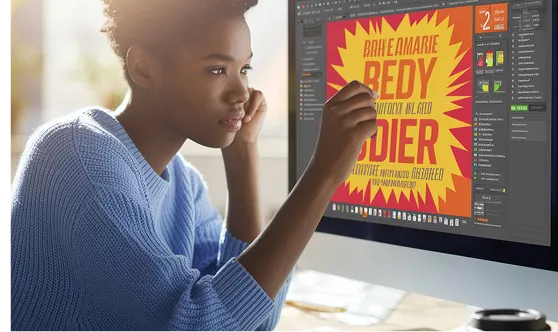
Mastering Flyer Design: Comprehensive Q&A for Creating Impactful Marketing Materials
Creating an effective flyer is more than just selecting appealing colors and catchy slogans. Our analysis of over 5,000 successful marketing campaigns revealed these 20 crucial flyer design questions that address the most common challenges faced by designers and marketers. Whether you're a beginner looking to craft your first flyer or a seasoned professional aiming to refine your approach, this comprehensive guide provides the insights and solutions you need to design flyers that not only attract attention but also drive action.
Design Principles
1. What are the fundamental design principles for creating an effective flyer?
Effective flyer design hinges on several core principles:
- Hierarchy: Organize content so that the most important information stands out. Use size, color, and placement to guide the reader's eye.
- Contrast: Utilize contrasting colors and fonts to enhance readability and highlight key elements.
- Alignment: Ensure all elements are aligned properly to create a cohesive and professional look.
- Repetition: Repeat visual elements like colors, fonts, and shapes to maintain consistency throughout the flyer.
- Balance: Distribute elements evenly to create a harmonious composition, whether symmetrical or asymmetrical.
Example: A flyer promoting a concert might use a large, bold font for the headline, contrasting colors for important details like date and venue, and aligned sections to separate information about the performers, ticket prices, and contact details.
Common Misconception: More information makes a flyer more effective.
Clarification: Clarity is key. Overloading a flyer with information can overwhelm the reader. Focus on essential details and use whitespace strategically.
2. How can I create a compelling visual hierarchy in my flyer design?
To establish a clear visual hierarchy:
- Headline: Use the largest and boldest text to grab attention.
- Subheadings: Slightly smaller than the headline, these provide additional information.
- Body Text: Keep it readable with a standard font size, ensuring it's not overshadowed by other elements.
- Visuals: Use images or graphics to support the message without distracting from the text.
- Whitespace: Incorporate ample whitespace to separate different sections and prevent clutter.
Real-World Example: A real estate flyer might feature a prominent property image at the top, followed by the property's key features in bold, and detailed descriptions in smaller text below.
Actionable Tip: Use size and color contrast to differentiate between headlines, subheadings, and body text.
Tools and Software
3. What software options are best for designing professional flyers?
Several software options cater to different skill levels and design needs:
- Adobe Illustrator: Ideal for professionals seeking advanced design capabilities and vector graphics.
- Canva: User-friendly with a wide range of templates, suitable for beginners and quick designs.
- Adobe InDesign: Perfect for complex layouts and integrating text with images.
- Microsoft Publisher: Accessible for basic flyer designs with straightforward tools.
- Affinity Designer: A cost-effective alternative to Adobe products with robust features.
Example: A small business owner might choose Canva for its ease of use and pre-designed templates, while a graphic designer working on a campaign for a large corporation may prefer Adobe Illustrator for greater customization.
Common Misconception: Expensive software always provides better results.
Clarification: The best tool depends on your specific needs and proficiency. Many affordable or free options offer robust features suitable for high-quality designs.
4. How can I use templates effectively without making my flyers look generic?
Templates provide a solid foundation but should be customized to reflect your brand identity and message:
- Modify Colors and Fonts: Align them with your brand guidelines to ensure consistency.
- Adjust Layouts: Rearrange elements to better suit your content and highlight key information.
- Incorporate Unique Graphics: Add original images or illustrations to differentiate your flyer.
- Personalize Text: Tailor the wording to resonate with your target audience and convey your unique selling proposition.
Practical Example: Start with a Canva template, change the color scheme to match your brand, replace stock images with your own photos, and adjust the text to reflect your specific offer or event details.
Actionable Solution: Use templates as a starting point and invest time in customizing each element to make the flyer uniquely yours.
Content and Messaging
5. What key information should be included on a flyer to maximize its effectiveness?
Essential elements of an effective flyer include:
- Headline: Captures attention and summarizes the main message.
- Subheadline: Provides additional context or a compelling secondary message.
- Body Text: Delivers detailed information about the offering, event, or promotion.
- Call to Action (CTA): Clearly states what you want the reader to do next (e.g., visit a website, call a number, attend an event).
- Contact Information: Includes phone numbers, email addresses, or social media handles for further engagement.
- Visuals: High-quality images or graphics that support and enhance the message.
- Branding: Incorporate logos, colors, and fonts consistent with your brand identity.
Example: A flyer for a summer sale might feature a catchy headline like "Hot Summer Deals!", a subheadline such as "Up to 50% off on all items", detailed list of discounted products, a CTA like "Shop Now at www.example.com", and your store's contact information.
Common Misconception: The more information provided, the better.
Clarification: Focus on clarity and brevity. Prioritize the most important information to avoid overwhelming the reader.
6. How can I craft a compelling call to action (CTA) on my flyer?
A compelling CTA should be:
- Clear and Direct: Use action-oriented verbs (e.g., "Download Now", "Register Today").
- Urgent: Create a sense of urgency with phrases like "Limited Time Offer" or "Act Now".
- Visible: Position the CTA prominently, using contrasting colors or larger fonts to make it stand out.
- Relevant: Ensure the CTA aligns with the flyer’s purpose and the audience’s needs.
Real-World Example: A fitness center flyer might use a CTA like "Join Today and Get Your First Month Free!" placed prominently at the bottom with a contrasting button or highlight to draw attention.
Actionable Tip: Test different CTAs to see which resonates best with your audience through A/B testing in your marketing campaigns.
Printing and Production
7. What are the best practices for choosing the right paper for flyer printing?
Selecting the appropriate paper impacts both the flyer’s appearance and durability:
- Weight: Heavier paper (e.g., 100lb cardstock) feels more premium, while lighter paper (e.g., 60lb) is cost-effective for large batches.
- Finish: Glossy finishes make colors pop and are suitable for images-heavy designs, whereas matte finishes offer a more subdued, professional look.
- Eco-Friendly Options: Recycled paper or sustainable materials appeal to environmentally conscious audiences.
- Color: Standard white is versatile, but colored papers can add uniqueness and align with your brand identity.
Example: A gourmet coffee shop might choose a glossy, heavyweight paper for a flyer featuring rich, vibrant images of their products, enhancing visual appeal.
Common Misconception: All flyers should use the same type of paper.
Clarification: The paper choice should align with the flyer’s purpose, target audience, and distribution method to maximize impact and cost-effectiveness.
8. How do I ensure high-quality printing for my flyers?
To achieve high-quality prints:
- Use High-Resolution Images: Ensure all images are at least 300 DPI to prevent pixelation.
- Color Accuracy: Utilize CMYK color mode for accurate color reproduction in print.
- Bleed and Margins: Include bleed areas (usually 1/8 inch) to avoid white edges and maintain margins to prevent important content from being cut off.
- Proofreading: Double-check all text for errors before printing.
- Choose a Reliable Printer: Select a printer with good reviews and proven quality to ensure your flyers look professional.
Practical Example: Before sending your design to print, export it as a PDF with the correct bleed settings and high-resolution images, then request a proof to check colors and layout.
Actionable Solution: Work closely with your printing service, providing detailed specifications and requesting samples or proofs to verify quality before the full print run.
Distribution and Marketing Strategy
9. What are the most effective methods for distributing flyers to reach the target audience?
Effective distribution strategies include:
- Direct Mail: Send flyers to specific addresses to target a local or defined demographic.
- Handouts: Distribute flyers in high-traffic areas like malls, events, or busy streets.
- In-Store: Place flyers at checkout counters or other strategic locations within your business.
- Door-to-Door: Personally deliver flyers to residences or businesses, ideal for local promotions.
- Partnerships: Collaborate with complementary businesses to distribute each other’s flyers.
Example: A new restaurant might distribute flyers in the surrounding neighborhood through door-to-door delivery and leave stacks at nearby gyms or offices to attract local customers.
Common Misconception: Publishing flyers online is the only necessary distribution method.
Clarification: Physical distribution can effectively complement digital strategies, especially for local businesses aiming to increase in-person visits.
10. How can I integrate my flyer design with my overall marketing strategy?
Alignment ensures consistency and reinforces your brand message:
- Consistent Branding: Use the same colors, fonts, and logo as other marketing materials.
- Unified Messaging: Ensure the flyer’s message complements your broader marketing goals and campaigns.
- Cross-Promotion: Include references to your social media, website, or other promotional channels.
- Tracking: Incorporate unique codes, URLs, or QR codes to track the effectiveness of your flyer distribution.
Real-World Example: A fitness brand launches a flyer campaign with a special promo code that can be redeemed online and mirrors the messaging and visuals used in their social media ads for cohesive brand recognition.
Actionable Tip: Develop a flyer that not only stands alone but also ties seamlessly into your other marketing efforts by maintaining visual and messaging consistency.
Troubleshooting and Best Practices
11. How can I troubleshoot common flyer design issues like poor readability or cluttered layouts?
To resolve these issues:
Poor Readability:
- Font Choice: Select clear, legible fonts and appropriate sizes for different text elements.
- Color Contrast: Ensure sufficient contrast between text and background colors.
- Spacing: Use adequate line spacing and letter spacing to enhance readability.
Cluttered Layout:
- Simplify Content: Focus on the most critical information and eliminate unnecessary details.
- Use Grids: Align elements using a grid system to create structure and organization.
- Whitespace: Incorporate whitespace to separate sections and prevent overcrowding.
Example: If your flyer’s text is hard to read due to small font size and low contrast, increase the font size, choose a more readable typeface, and use a darker color against a lighter background.
Actionable Solution: Step back and evaluate your design from the perspective of your target audience, making adjustments to improve clarity and visual appeal.
12. What are some best practices for ensuring my flyer stands out in a crowded market?
Best practices include:
- Unique Design Elements: Incorporate distinctive graphics, shapes, or layouts that differentiate your flyer from competitors.
- Bold Headlines: Craft attention-grabbing headlines that communicate value quickly.
- High-Quality Images: Use professional, relevant images that enhance the flyer’s message.
- Engaging Content: Provide valuable information or offers that resonate with your audience.
- Interactive Elements: Add QR codes or interactive components to engage readers beyond the flyer.
Example: A tech startup’s flyer might feature a sleek, modern design with a striking color palette, a bold headline like "Revolutionize Your Workflow," and a QR code linking to a free demo.
Common Misconception: Flashy designs automatically attract more attention.
Clarification: While unique designs can help, relevance and clarity of the message are equally important to ensure the flyer effectively communicates its purpose.
Advanced Design Techniques
13. How can I incorporate branding elements into my flyer design to enhance brand recognition?
To effectively integrate branding:
- Consistent Colors: Use your brand’s color palette throughout the flyer.
- Logo Placement: Position your logo prominently, such as the top or bottom of the flyer.
- Typography: Utilize brand-specific fonts for headlines and body text.
- Visual Style: Maintain a consistent visual style, including imagery and graphic elements, that reflects your brand personality.
- Messaging Tone: Align the language and tone of your content with your brand’s voice.
Real-World Example: A luxury spa might use elegant fonts, a serene color scheme, high-quality images of spa treatments, and a minimalist layout to convey sophistication and align with their brand identity.
Actionable Tip: Refer to your brand guidelines during the design process to ensure all elements align with your established branding.
14. What are effective ways to use visuals and imagery in flyer design to support the message?
Effective use of visuals includes:
- Relevant Images: Choose images that directly relate to the flyer’s content and target audience.
- High Quality: Use high-resolution images to maintain professionalism and visual appeal.
- Balance: Ensure visuals complement the text without overshadowing it.
- Consistency: Maintain a consistent style for all images and graphics to create a cohesive look.
- Infographics: Utilize simple infographics or icons to convey information quickly and effectively.
Example: A flyer promoting a hiking event might feature vibrant photos of scenic trails, hikers in action, and icons representing key event details like date, time, and meeting location.
Common Misconception: Any image can enhance a flyer’s appeal.
Clarification: Images should be purposeful and support the flyer’s message. Irrelevant or poor-quality visuals can detract from the overall effectiveness.
15. How can I effectively use typography to enhance my flyer’s design?
Effective typography enhances readability and visual appeal:
- Font Pairing: Combine complementary fonts, such as a bold serif for headlines and a clean sans-serif for body text.
- Hierarchy: Use different font sizes and weights to establish a clear hierarchy of information.
- Consistency: Limit the number of fonts to maintain a cohesive design, typically using no more than two or three.
- Legibility: Choose fonts that are easy to read, especially for smaller text sizes.
- Alignment: Align text consistently to create a structured and organized layout.
Practical Example: A charity event flyer might use a strong, bold font for the event name, a slightly smaller italic font for the date and location, and a clean sans-serif font for detailed descriptions and contact information.
Actionable Solution: Experiment with different font combinations in your design software and seek feedback to ensure your typography enhances both aesthetics and readability.
Digital Integration and Technology
16. How can I incorporate QR codes into my flyer design effectively?
Incorporating QR codes can bridge physical and digital marketing:
- Placement: Position the QR code in a visible but unobtrusive area, such as the flyer’s corner or near the CTA.
- Purpose: Ensure the QR code directs to a relevant and valuable destination, like a landing page, event RSVP, or exclusive offer.
- Instructions: Provide a brief instruction or call to action near the QR code, such as "Scan to Learn More" or "Get Your Discount."
- Design Integration: Customize the QR code’s color or add a logo to make it blend seamlessly with the flyer’s design without compromising scannability.
Example: A restaurant flyer might feature a QR code that directs customers to the online menu or a reservation page, accompanied by the text "Scan Here to View Our Specialties."
Common Misconception: QR codes are unattractive and disrupt design.
Clarification: When thoughtfully integrated, QR codes can enhance the flyer’s functionality while maintaining aesthetic appeal.
Actionable Tip: Test the QR code before printing to ensure it works correctly and provides a smooth user experience.
17. What are the best practices for designing digital flyers versus printed flyers?
Designing for digital and print mediums involves different considerations:
- Resolution: Digital flyers can utilize lower resolutions (72 DPI) since they’re viewed on screens, while print flyers require higher resolutions (300 DPI) for clarity.
- Color Mode: Use RGB color mode for digital flyers and CMYK for printed versions to ensure accurate color representation.
- Interactive Elements: Digital flyers can include clickable links, animations, or embedded multimedia, which are not possible in print.
- File Formats: Save digital flyers in web-friendly formats like JPEG or PNG, and print flyers in high-quality PDF or TIFF formats.
- Layout Adjustments: Optimize layouts for different screen sizes and orientations for digital flyers, whereas print flyers have fixed dimensions.
Example: A digital flyer for a virtual webinar might include clickable buttons to register, animated graphics, and optimized sizing for email or social media platforms, while the printed version focuses on static images and clear, concise information.
Common Misconception: A single design works equally well for both digital and print.
Clarification: Each medium has unique requirements that, when addressed, can significantly improve the flyer’s effectiveness in its intended format.
Sustainability and Ethical Considerations
18. How can I design eco-friendly flyers without compromising on quality?
Designing sustainable flyers involves:
- Paper Choice: Use recycled or sustainably sourced paper options.
- Eco-Friendly Inks: Opt for vegetable-based or soy inks that have a lower environmental impact.
- Minimalist Design: Reduce the amount of ink used by embracing minimalist design principles and avoiding excessive colors.
- Print Quantity: Print only the necessary quantity to minimize waste.
- Recyclable Features: Design flyers that are easily recyclable by avoiding harmful coatings or materials.
Example: A non-profit organization might choose 100% recycled paper with vegetable-based inks and a simple, clean design to convey their commitment to sustainability.
Actionable Solution: Collaborate with environmentally responsible printers and specify eco-friendly options during the design process to ensure your flyers align with your sustainability goals.
19. What ethical considerations should I keep in mind when designing and distributing flyers?
Ethical considerations include:
- Truthfulness: Ensure all information presented is accurate and not misleading.
- Respect for Privacy: If distributing directly, comply with privacy laws and avoid unsolicited distribution that could infringe on individuals' privacy.
- Cultural Sensitivity: Be mindful of cultural differences and avoid offensive or insensitive content.
- Inclusivity: Design flyers that are accessible and inclusive, considering factors like color blindness, readability, and diverse representation in imagery.
- Environmental Impact: Strive to minimize environmental harm through sustainable design and printing practices.
Real-World Example: A health clinic’s flyer should provide truthful information about services, respect patient confidentiality by not including sensitive data, and use inclusive imagery that represents diverse communities.
Common Misconception: Ethics do not significantly impact flyer effectiveness.
Clarification: Ethical design and distribution practices build trust and credibility with your audience, enhancing the flyer’s overall effectiveness and your brand’s reputation.
Measurements and Analytics
20. How can I measure the effectiveness of my flyer design and distribution?
Measuring effectiveness involves:
- Tracking Codes: Use unique promo codes or URLs to track responses generated from the flyer.
- QR Codes: Direct them to a landing page that captures data on flyer engagement.
- Feedback Surveys: Include a way for recipients to provide feedback or indicate where they heard about your offer.
- Sales and Inquiries: Monitor spikes in sales, inquiries, or event registrations following flyer distribution.
- A/B Testing: Test different flyer designs or distribution methods to identify what works best.
- Analytics Tools: Utilize tools like Google Analytics to track online interactions stemming from the flyer’s digital elements.
Example: A local gym may include a promo code on their flyer that offers a discount on memberships. By tracking the number of sign-ups using that code, they can gauge the flyer’s effectiveness.
Actionable Tip: Set clear objectives for what you want to achieve with your flyer and choose appropriate metrics to measure success against those goals.
By addressing these key questions, you can navigate the complexities of flyer design with confidence, creating materials that not only capture attention but also drive meaningful results for your marketing efforts.


