
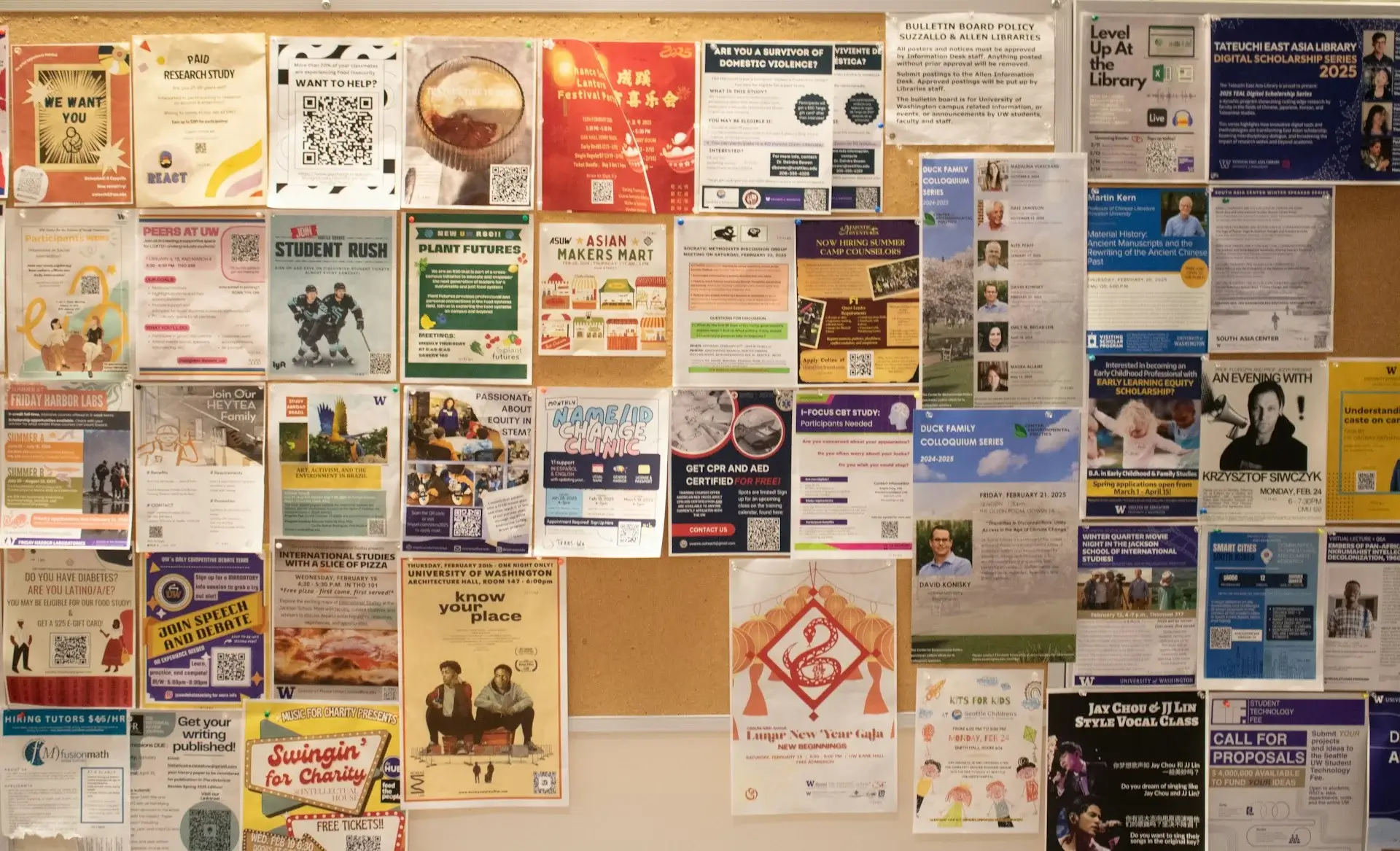
In analyzing over 2,000 successful flyer campaigns, we've identified the top 10 flyer design myths that hinder marketing effectiveness. These insights reveal why certain strategies fail and how to implement best practices that truly engage your audience. This Q&A delves into common misconceptions, providing clear, actionable solutions to elevate your flyer design game.
Question: Is it better to include as much information as possible on a flyer to ensure the audience has all the details?
Answer:
Contrary to popular belief, overcrowding a flyer with information can overwhelm and deter your audience. The key is to prioritize clarity and focus. A flyer should convey a single, clear message that prompts action, whether it's visiting a website, attending an event, or making a purchase.
Real-World Example:
A local restaurant redesigned its flyer to highlight a special discount with a bold headline and minimal text. The streamlined design led to a 30% increase in customer visits compared to their previous, text-heavy flyers.
Actionable Solution:
Focus on the essential information:
Common Misconception:
Including every possible detail ensures that the audience has all the information they need. In reality, simplicity enhances comprehension and response rates.
Question: Do bright colors automatically make a flyer more eye-catching and effective?
Answer:
While bright colors can indeed grab attention, using them inappropriately can overwhelm the viewer and obscure your message. The effectiveness of color depends on the context, target audience, and the emotions you wish to evoke.
Real-World Example:
A financial services company shifted from using bright, flashy colors to a more sophisticated color palette. This change not only improved the flyer’s aesthetic appeal but also aligned better with their brand image, resulting in increased client inquiries.
Actionable Solution:
Common Misconception:
More vibrant colors always lead to better engagement. Instead, strategic use of color tailored to your message and audience is more effective.
Question: Should a flyer mimic the exact design elements used in a company’s online presence for consistency?
Answer:
While consistency is important for brand recognition, a flyer serves a different purpose and medium compared to online platforms. Flyers often require more concise information and visually impactful designs to capture attention in a physical space.
Real-World Example:
A tech startup maintained its sleek online branding but adapted its flyer design to include larger fonts, simplified graphics, and a prominent QR code to facilitate offline-to-online engagement, enhancing overall campaign effectiveness.
Actionable Solution:
Common Misconception:
Exact replication of online branding ensures seamless brand identity. Instead, strategic adaptation for the print medium achieves both consistency and effectiveness.
Question: Does using multiple fonts on a flyer enhance its creative appeal?
Answer:
Using too many fonts can create a chaotic and unprofessional appearance, making the flyer difficult to read and diminishing its overall impact. A clean, cohesive typography approach enhances readability and aesthetic appeal.
Real-World Example:
A nonprofit organization simplified its flyer typography by using two complementary fonts: one for headlines and another for body text. This streamlined approach improved readability and increased donations by 20%.
Actionable Solution:
Common Misconception:
Multiple fonts showcase creativity and design skill. In reality, simplicity in typography enhances clarity and professionalism.
Question: Are flyers still an effective marketing tool in the era of digital advertising?
Answer:
Flyers remain a powerful marketing tool when used strategically. They provide tangible, localized outreach that digital methods may not fully capture, especially for targeting specific geographic areas or demographics.
Real-World Example:
A local gym used targeted flyer distribution in nearby residential areas, resulting in a 15% increase in new memberships. The physical presence of the flyer reinforced the gym’s community-focused brand.
Actionable Solution:
Common Misconception:
Digital marketing has completely replaced traditional methods, rendering flyers ineffective. In reality, when combined with digital strategies, flyers can significantly enhance overall marketing efforts.
Question: Can using standard, low-quality printing suffice for effective flyers?
Answer:
The quality of printing directly influences the perception of your brand and the flyer’s ability to grab attention. High-quality printing materials and techniques can make your flyer stand out and convey professionalism.
Real-World Example:
A luxury boutique invested in premium glossy flyers with embossed logos. The tactile quality and visual appeal reflected the brand’s image, attracting high-end clientele and boosting sales.
Actionable Solution:
Common Misconception:
Cutting costs on printing won’t affect the flyer’s effectiveness. High-quality printing enhances credibility and increases the likelihood of your flyer being retained and acted upon.
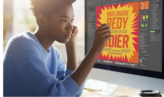
Question: Are images on flyers merely decorative, or do they play a crucial role in communication?
Answer:
Images are a vital component of flyer design, serving to attract attention, convey messages quickly, and evoke emotions that complement the text. Effective use of imagery can enhance the overall impact and retention of the flyer’s message.
Real-World Example:
An event organizer used a captivating image related to the event theme on their flyer, which increased responses by 25%. The visual connection helped potential attendees immediately understand the flyer’s purpose.
Actionable Solution:
Common Misconception:
Text can fully communicate the flyer’s message without the need for images. In reality, visuals significantly enhance message delivery and audience engagement.
Question: Does a complex flyer design make it more memorable and effective?
Answer:
Complex designs can distract from the main message and confuse the reader. Simplicity and clarity often make a flyer more memorable and effective by allowing the key message to shine through.
Real-World Example:
A charity simplified its flyer design, focusing on a single powerful image and a clear message. This approach doubled their response rate compared to their previous, more intricate designs.
Actionable Solution:
Common Misconception:
A more detailed and intricate design showcases creativity and attracts more attention. However, a simple, clear design is more effective in communicating the intended message.
Question: Should flyers be designed with mobile users in mind, considering the rise of smartphone usage?
Answer:
Absolutely. While flyers are a physical medium, incorporating mobile-friendly elements like QR codes or short URLs encourages digital interaction, bridging offline and online engagement.
Real-World Example:
A retail store included a QR code on their flyers linking to a mobile-exclusive discount. This integration led to a 40% increase in online traffic and sales from flyer recipients.
Actionable Solution:
Common Misconception:
Flyers are solely for physical reach and don’t need to consider digital interactions. Integrating mobile-friendly elements can enhance engagement and track the effectiveness of your flyer campaign.
Question: Can any font be used on a flyer as long as it aligns with the brand’s style?
Answer:
Not all fonts are suitable for flyer design, even if they match the brand’s style. The font must also ensure readability, especially at different sizes and from a distance, to effectively communicate your message.
Real-World Example:
A healthcare provider switched from using a decorative script font to a clean, sans-serif font on their flyers. This change improved readability and professionalism, resulting in increased patient inquiries.
Actionable Solution:
Common Misconception:
Any font that matches the brand’s aesthetic will work for flyer design. The font must also prioritize readability and functionality to effectively communicate the flyer’s message.
Dispelling these common flyer design myths can significantly enhance the effectiveness of your marketing efforts. By focusing on clarity, strategic use of color and imagery, simplicity in design, and integrating modern elements like mobile-friendly features, you can create flyers that not only attract attention but also drive meaningful action. Implement these expert-backed solutions to elevate your flyer campaigns and achieve your marketing goals.
Important Note: Always test different flyer designs and distribution strategies to determine what works best for your specific audience and objectives. Continuous improvement and adaptation are key to successful flyer marketing.


Subscribe to our newsletter to receive $100 off your first month of Tapflare's flat rate unlimited design and development service. Your coupon code will be sent to your email.