

Tapflare Article
Why Website Redesigns Fail (And How to Fix It)
Inside this article
- 01Executive Summary
- 02Introduction and Background
- 03What Website Redesign Failure Actually Looks Like
- 04Strategic and Organizational Causes of Redesign Failure
- 05Technical SEO Mistakes That Sink Redesigns
- 06User Experience, Accessibility, and Performance Regressions
- 07How to Plan a Website Redesign That Works
- 08Data Analysis and Evidence
- 09Case Studies and Real-World Examples
- 10Implications and Future Directions
- 11Frequently Asked Questions (FAQs)
- 12Conclusion
Executive Summary
Website redesigns fail for a small, repeatable set of reasons, and the evidence for each is now well documented. The most common root cause is strategic: teams start rebuilding a site before defining measurable goals, letting subjective preference and internal politics substitute for user data. The Nielsen Norman Group (NN/g) warns that a sound redesign "is based on user data and has clear goals and measures of success" [1], while CXL's conversion research group has observed redesigns driven by "clueless marketing execs" rather than tested evidence [2]. UX researcher Jared Spool documented one $100 million "flip the switch" redesign in which sales dropped 20% at launch and took three and a half years to recover [3] [4].
A second, equally damaging failure mode is technical: search engine optimization (SEO) mistakes made during migration. Google's own documentation confirms that properly implemented 301 redirects "don't cause a loss in PageRank" [5], yet redesigns routinely skip that step. Ahrefs documented a real migration that deleted roughly 15% of a site's pages and lost the site almost 50% of its organic traffic [6], and Moz's own migration specialist, who has run more than 100 site migrations, describes losing half a site's traffic overnight as a routine failure pattern [7]. Search Engine Journal's analysis of 892 domain migrations found the average site took 523 days to recover pre-migration organic traffic levels, and 17% of migrated domains never recovered at all [8] [9].
A third failure mode is user-facing: redesigns that break accessibility and performance without anyone noticing until launch. WebAIM's 2026 analysis of one million home pages found 56,114,377 distinct accessibility errors across the sample [10], and accessibility vendor Siteimprove argues that "the biggest accessibility risk is not new gaps. It is regression" introduced by redesign work itself [11]. NN/g's Jakob Nielsen has separately argued that even a genuinely improved interface will initially test worse simply because "a fresh design will be a worse design simply because it's new" to returning users [12].
The consequences are visible in named, well-documented cases. Digg's 2010 "Digg v4" redesign triggered a traffic collapse of 26% in the United States and 34% in the United Kingdom within weeks [13]. Snap Inc. confirmed its 2018 Snapchat redesign cost the company daily active users, falling from 191 million to 188 million in a single quarter, after more than a million users signed a petition demanding a reversal [14]. Gap abandoned a new logo within roughly a week of launch after online backlash and an estimated $247 million in stock value loss [15], and Cracker Barrel reversed its 2025 logo redesign within about a week before terminating its relationship with the design agency responsible six weeks later [16].
None of this means redesigns are inherently doomed. NN/g's own case work on a business-to-business manufacturer's site found that a research-driven, incrementally tested redesign improved product findability by 85% and raised tree-testing scores from 4.0 to 7.4 out of 10 [17] [18]. The evidence, taken together, points to a consistent prescription: define measurable goals before design work starts, treat the existing site as a working prototype rather than discarding it, map every redirect before launch, test with real users throughout rather than only at the end, and prefer incremental, evolutionary changes over a single high-risk "big bang" relaunch whenever the underlying technology allows it.
Introduction and Background
A website redesign is, in principle, a routine investment: refresh the visual design, modernize the technology, and improve conversion. In practice it is one of the riskiest projects a marketing or product organization undertakes, because a redesign touches search visibility, user habits, accessibility compliance, and performance simultaneously, and a mistake in any one of those dimensions can erase months of traffic or revenue before anyone notices. Clutch's database of verified client reviews puts the average cost of a web design project at $38,105.39, typically delivered over roughly a seven-month timeline, with agency-quoted budgets ranging from $2,000 to $100,000 depending on scope [19] [20]. McKinsey's transformation research, covering the broader category of large digital and organizational change efforts that a full-scale redesign belongs to, finds that seventy percent of such transformations fail to meet their stated objectives [21].
The stakes are compounded by how little patience users extend to a new interface, and how fast search engines can react to a bad migration. NN/g's eyetracking research found that visitors typically abandon a web page within 10 to 20 seconds unless its value proposition is instantly clear [22], and a Storyblok-commissioned survey of 6,000 online shoppers across the United States and Europe found that 60% had abandoned a purchase specifically because of poor website user experience [23]. On the technical side, Google's own guidance acknowledges that a site move can take "a few weeks" for search rankings to stabilize even when done correctly [24], and Search Engine Journal's practitioner research distinguishes a normal, temporary post-launch dip of roughly 10 to 30% from a "migration hangover" in which unresolved technical errors cause traffic to fall 50% or more and stay down [25].This report examines why website redesigns fail across four interlocking dimensions: strategic and organizational decision-making, technical SEO execution, user experience and accessibility, and process discipline. It draws on primary guidance from Google, the World Wide Web Consortium (W3C), NN/g, CXL, and named, independently reported case studies including Digg, Snapchat, Gap, Marks & Spencer, and Cracker Barrel, alongside quantitative research from Deloitte, WebAIM, Clutch, Moz, Ahrefs, and Search Engine Journal. It closes with a data-driven, checklist-based framework for planning and executing a redesign that preserves rather than destroys the value of an existing site, as of July 2026.
What Website Redesign Failure Actually Looks Like
"Failure" in a website redesign rarely means the new site does not launch. It almost always means the new site launches successfully by internal project standards, on schedule and within scope, while quietly destroying value that the organization did not think to measure. Four distinct failure categories recur across the evidence base, and most real-world failures are a combination of two or more.
The first category is strategic failure: the redesign proceeds without a documented definition of success. Consultancy analysis of website rebuild projects describes scope drift as a direct consequence of having "no agreed definition of success, no controlled list of deliverables, no documented assumptions" at the outset [26]. NN/g frames this as a scope-severity mismatch: teams should "never make radical changes when minimal adjustments will suffice," because sweeping redesigns "have a higher chance of inadvertently breaking something critical for users" [27] [28].
The second category is technical and SEO failure: search visibility, indexation, and crawlability break during or after the migration. Search Engine Journal's terminology for the severe version of this, a "migration hangover," describes a scenario where technical errors left unresolved after launch cause Google to progressively de-index the new site [29].
The third category is user experience and accessibility failure: the new design breaks workflows, keyboard navigation, or assistive-technology compatibility that the old design supported, often invisibly to the sighted, mouse-using stakeholders who approved the launch. Accessibility vendor Siteimprove's research on redesigns concludes that "the biggest accessibility risk is not new gaps. It is regression," meaning previously compliant, working pages stop working after a template change [11].
The fourth category is organizational and governance failure: cost and timeline overruns, internal conflict, and an inability to make decisions because no one owns the outcome. Jared Spool's research into large-scale "flip the switch" redesigns found they are commonly "overburdened by corporate politics, the need for every one" stakeholder group to see their priorities represented in the launch [30]. These four categories interact: a strategic failure to define success metrics makes an SEO failure more likely (no one is watching organic traffic as a launch gate), and an accessibility failure often surfaces only when a governance failure means no one was assigned to own it, a pattern accessibility-compliance vendor Siteimprove addresses directly by insisting cross-functional redesign teams assign "a named owner" to each risk category, including accessibility [31].
Strategic and Organizational Causes of Redesign Failure
Redesigning Without Data or Defined Goals
The single most consistent theme across independent UX research is that redesigns fail when they are not grounded in evidence. NN/g's guidance is explicit that a defensible redesign "is based on user data and has clear goals and measures of success," not on a stakeholder's aesthetic preference [1]. NN/g further argues that quantitative evidence should settle scope disputes precisely because "solid numbers keep you focused on the right issues and prevent political arguments" [32]. CXL's conversion-optimization research reaches the identical conclusion from a commercial angle, stating flatly that "redesign is not a gut feeling, it is a strategy" and that "you should never trust your gut feeling" when making design decisions [33] [34].
The HiPPO and Design-by-Committee Problem
A closely related pattern is decision-making driven by internal seniority rather than evidence, a phenomenon researchers commonly call the HiPPO, an acronym for "Highest Paid Person's Opinion." Microsoft experimentation researcher Ronny Kohavi documented a canonical case in which a senior stakeholder's instinct nearly killed a shopping-cart recommendation feature that data later proved highly successful; internal notes on the episode record that "HiPPO (Highest Paid Person's Opinion) was: stop the project" before controlled testing overruled the objection [35]. CXL identifies a related pattern, design by committee, in which the redesign's visual direction is set by people with no conversion expertise: "this happens when visual designers decide what your site should be like," typically without any conversion-rate or usability data informing the decision [2]. CXL's broader assessment of redesign risk is unambiguous: "website redesigns only work if they are carefully managed and data-driven" [36].
Skipping User Research Until It Is Too Late
NN/g's usability study of a university website that broke standard web conventions found that even minimal upfront testing catches most catastrophic design errors: "a single day of user research easily identifies the worst design flaws" [37]. Yet the same case study observed that in most redesign projects, "usability is neglected until the very end of development," by which point changes are expensive and politically difficult [38]. CXL's structured redesign process addresses this directly by scheduling the first usability test on the new design roughly two weeks before launch, timed against the development schedule rather than left as an afterthought [39]. Even research-informed redesigns are not immune to disappointment: CXL notes that Comparis, a company that conducted user research before its redesign, still saw conversions fall by more than 10% after launch, illustrating that research reduces but does not eliminate redesign risk [40].
The "Flip the Switch" Risk of Full Relaunches
The riskiest redesign pattern, by the available evidence, is the full replacement launch, sometimes called a "rip and replace" or "flip the switch" redesign, in which an entirely new site goes live at once rather than through staged, tested increments. Jared Spool documented a $100 million e-commerce redesign of this type that caused an immediate 20% sales decline and took three and a half years for sales to recover to pre-launch levels [3] [4]. Spool attributes the poor outcomes of full relaunches specifically to internal politics, describing them as commonly "overburdened by corporate politics, the need for every one" internal group wanting representation in a single, high-visibility launch [30]. His subsequent guidance recommends incremental architectural change specifically to capture improvement "without the risks of a re-launch" [41]. Retailer Marks & Spencer's 2014 relaunch is a documented, independently reported instance of this dynamic: the company's own online sales fell 8% in the three months following the new site's launch, which the Guardian's reporting attributed to customers being "unable to navigate through the glossy-magazine-style articles and videos to make purchases" on the redesigned pages [42] [43].
Technical SEO Mistakes That Sink Redesigns
Search visibility is the most measurable, and most frequently mishandled, casualty of a website redesign. Google's own site-move documentation lays out the core technical requirements, and independent case studies show how often they are ignored.
What Google Actually Requires
Google's guidance confirms that permanent (301) redirects, correctly implemented, "don't cause a loss in PageRank," the link-equity signal that underlies much of organic ranking [5], and recommends keeping redirect chains short, "ideally no more than 3 and fewer than 5" hops, to avoid crawl and latency problems [44]. Google also instructs teams to plan, in advance of launch, exactly how a staging site's robots.txt restrictions will be reversed, since forgetting to lift a staging block is one of the most common launch-day errors: teams should "prepare what the robots.txt file should look like once the site move starts" [45]. For content that is genuinely retired rather than relocated, Google expects a real error status rather than a silent redirect to the homepage, instructing site owners to "provide errors for deleted or merged content" using proper 404 or 410 responses [46]. Even a technically correct migration will show some ranking movement, since Google's documentation notes it "can take a few weeks for most pages to move in our index" as it reprocesses the new URL structure [24].
Where Migrations Actually Go Wrong
In practice, the gap between Google's guidance and real-world execution is where the damage happens. Ahrefs documented a migration in which a site deleted roughly 15% of its indexed pages during a redesign and lost almost 50% of its organic traffic as a result [6]. Moz's Alex Moran, drawing on personal experience running more than 100 website migrations, describes the sudden-collapse scenario bluntly: teams discover that "50% of your website traffic has vanished into thin air" once the new site goes live [7]. Moz separately documented a large United Kingdom retailer whose HTTP-to-HTTPS migration, a comparatively simple technical change compared to a full redesign, still cost the site 35% of its search visibility within two weeks [47]. Moz's assessment of Google's own guidance is pointed: the company argues Google's documentation "downplays the fact that so often they result in significant traffic and revenue loss" [48].
Two specific technical errors recur across post-mortems. The first is leaving staging-environment noindex tags active after launch, which causes Google to progressively remove the entire new site from its index; Search Engine Journal describes the mechanism directly: "Google is instructed to ignore the pages and starts to de-index the entire site" [29]. Semrush's migration checklist treats this as a defined, temporary state that must be actively reversed: "your noindex tag is temporary, and you'll want to remove it prior to pushing" the site live [49]. The second recurring error is leaving canonical tags pointing at the old, now-defunct URLs, which causes Google to keep crediting pages that no longer exist while ignoring their replacements: "Google will continue to credit the old URLs and ignore the new ones" [50]. Moz's own migration checklist additionally warns against overcorrecting with blanket protective measures, cautioning teams to "avoid blocking sites with robots.txt or using a noindex tag on every page" as a misguided safety net [51].
Recovery Takes Longer Than Most Teams Plan For
Search Engine Journal's analysis of 892 domain migrations found the average migrated domain took 523 days, roughly a year and five months, to return to its pre-migration level of organic traffic [8], and found that 17% of the migrated domains in the sample never recovered their pre-migration traffic level at all [9]. A separate, real-world case study of a 1,500-page website replatforming published in 2026 illustrates a subtler variant of the same problem: even though the site's median search ranking position improved after the move, organic clicks fell 45% year over year because click-through rate on the same terms collapsed from 0.85% to 0.39%, showing that ranking position alone does not guarantee traffic [52] [53]. Not every migration ends this way: Moz's own migration of roughly 100,000 forum URLs avoided the typical dip entirely, and organic traffic to the migrated section rose nearly 19% within two months, a result Moz attributes to disciplined redirect mapping and pre-launch crawl auditing rather than luck [54], against a stated industry expectation of "a 15-30% dip in traffic for 1-3 months while Google processes all the URLs" on a typical migration [55].
User Experience, Accessibility, and Performance Regressions
Change Aversion Is Predictable, Not Diagnostic
One of the most counterintuitive findings in redesign research is that negative user reaction to a new design is largely inevitable and does not, by itself, indicate the new design is worse. NN/g's Jakob Nielsen states this directly: "a fresh design will be a worse design simply because it's new" to users who have built habits around the old interface [12], and that "it's a law of nature that users hate change" regardless of whether the underlying interface has objectively improved [56]. NN/g's related video commentary reinforces that initial backlash to a redesign "simply means that it's new, and users don't like to learn different ways" of doing familiar tasks, which means teams need a way to distinguish temporary adjustment friction from genuine usability regression before treating public complaints as proof of failure [57].
Accessibility Regresses Quietly
The World Wide Web Consortium's Web Accessibility Initiative (WAI) explicitly names redesign work as a recurring source of accessibility regression, noting that accessibility requires ongoing monitoring through "daily content publishing and maintenance activities, as well as broader redesign and development efforts" [58], and frames every content or template change, redesigns included, as a moment that "can introduce accessibility issues, and provide opportunities for improvement" simultaneously [59]. WebAIM's 2026 audit of one million home pages found 56,114,377 distinct accessibility errors across the sample, an average of dozens of errors per page, at a moment when accessibility litigation and regulatory scrutiny are both rising [10]. Counterintuitively, the same research found that pages using more Accessible Rich Internet Applications (ARIA) attributes, a marker of the more complex, JavaScript-heavy component libraries common in modern redesigns, had significantly more errors on average than pages without ARIA at all: "had significantly more errors (59.1 on average) than pages without ARIA (42 on average)" [60]. Siteimprove's research on redesigns specifically identifies broken keyboard navigation as a mechanical, predictable failure mode: "template changes break keyboard navigation when new component structures do not preserve tab order" [61].
Performance Regressions Have a Direct Revenue Cost
Redesigns frequently add new frameworks, larger images, and additional third-party scripts without a corresponding performance budget, and the data on what that costs is unusually well quantified. Google's official Core Web Vitals guidance sets the Largest Contentful Paint (LCP) threshold, the point at which a page's main content becomes visible, at "sites should strive to have Largest Contentful Paint of 2.5 seconds or less" (Source: web.dev), and the Interaction to Next Paint (INP) responsiveness threshold, which measures how quickly a page reacts to a click or tap, at under 200 milliseconds [62]. A large-scale Google analysis of 11 million mobile landing pages found the average full page load time was still about 15 seconds as of its analysis [63], and the same research, built on a neural-network model of visitor behavior, found that as mobile page load time increases from one second to ten seconds, the probability of a visitor bouncing rises 123% [64], while page complexity carries a similarly steep cost: as the number of on-page elements rises from 400 to 6,000, a jump typical of a redesign that adds new modules and third-party widgets, conversion probability drops 95% [65]. The inverse relationship holds too: Deloitte's study of European and American retail, travel, and lead-generation sites found that a mobile speed improvement of just 0.1 seconds raised retail conversions by 8.4% and average order value by 9.2% [66], and improved lead-generation page bounce rate by 8.3% [67].
Replatforming Adds Its Own Risk
Many redesigns bundle a visual overhaul with a content management system (CMS) migration, and each carries independent risk. Industry analysis of CMS migrations notes that "traffic drops of 30-60% are well-documented for major CMS platform changes" when the underlying content architecture changes alongside the visual layer [68], and warns that the human cost is frequently underestimated, since editorial teams "need support to adopt and learn a new workflow" rather than simply receiving new software [69].
How to Plan a Website Redesign That Works
Recognizing When a Redesign Is Actually Needed
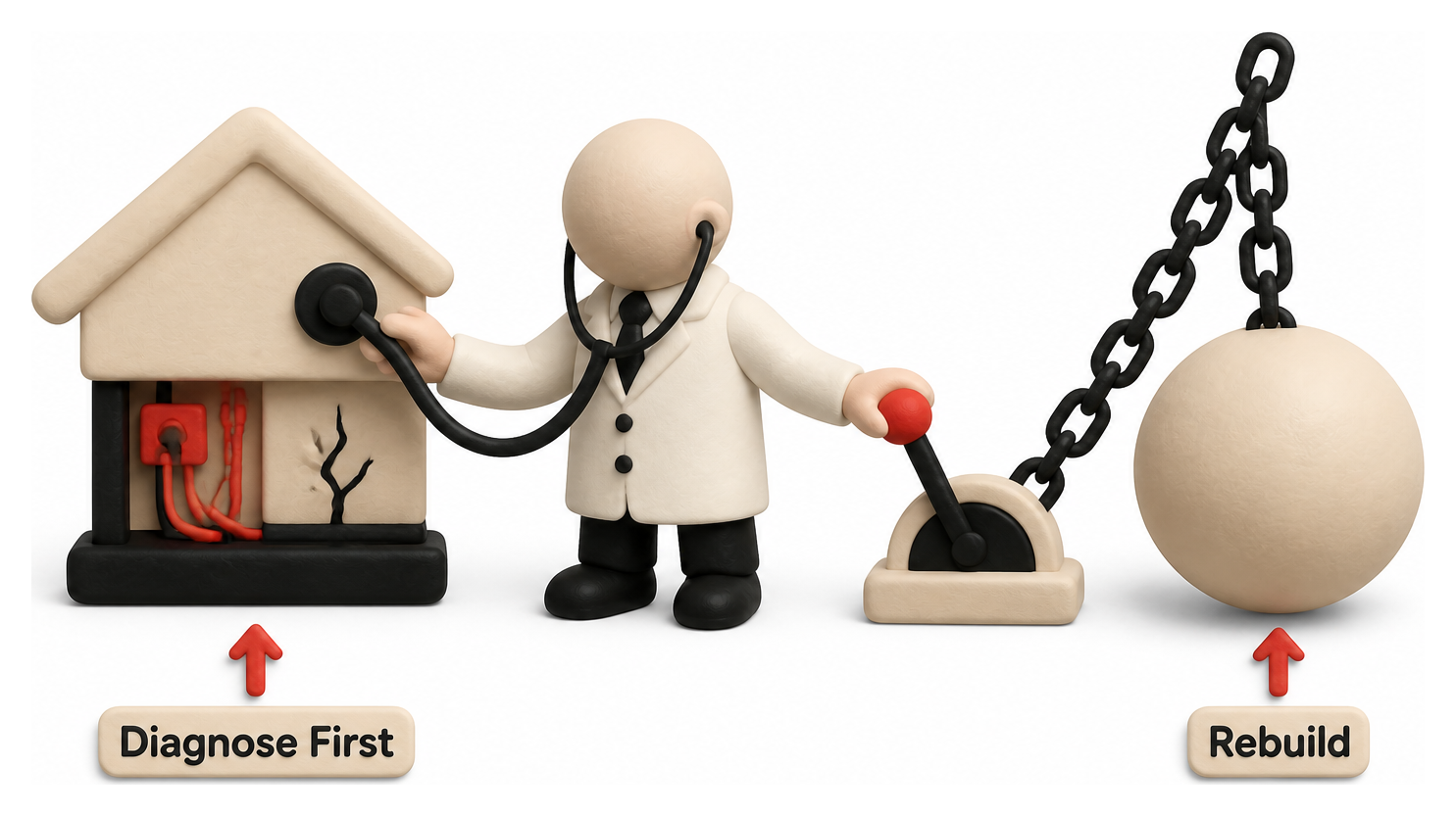
Not every website problem calls for a full redesign, and the evidence suggests teams should default to incremental fixes unless specific conditions are met. NN/g identifies severely outdated backend technology that blocks essential functionality as a legitimate trigger for a full rebuild: a redesign is justified when "the technology is severely outdated, making critical changes impossible," such as when the platform cannot support mobile access or modern security requirements [70]. NN/g's second trigger is systemic, unfixable underperformance: a redesign is warranted when "data analysis reveals a bounty of issues that are impossible to fix to customers' satisfaction" through incremental tweaks alone [71]. HubSpot's practitioner guidance adds a common, observable warning sign: "a high bounce rate is a red flag that visitors are not finding what they want" on the current site [72], and identifies unmanageable platform sprawl, "having to integrate dozens of plugins to enable business, website, and other functions," as a common trigger for full replatforming as a business scales [73].
Treat the Existing Site as a Prototype, Not Waste
A recurring theme in NN/g's redesign methodology is that teams routinely discard information they should be using. Before any new design work begins, NN/g recommends benchmarking the current site and its direct competitors through structured usability testing, because "resist the urge to jump on your computer and start designing right away" is the single most common process mistake it observes [74]. NN/g frames the existing site itself as an underused asset, arguing that the "old site is the best prototype of your new site" because it already reflects years of real user behavior and feedback that a from-scratch design has no way to replicate [75].
A Structured, Data-Driven Redesign Checklist
Combining NN/g's, CXL's, and accessibility-vendor guidance produces a consistent, testable process. The following checklist reflects points that recur, independently, across multiple authoritative sources:
- Define measurable success criteria before design work starts, using conversion rate, task completion, or search-visibility targets, not subjective preference, as NN/g's data-first framing requires [1].
- Run a structural content and information architecture (IA) audit of the existing site, since, as A List Apart's guidance puts it, "structural audits have an important and singular purpose: to help us build a new sitemap" grounded in how the current site actually functions [76].
- Conduct stakeholder interviews across business, technical, and design groups early, using short, structured sessions; CXL's process specifies "schedule one-hour meetings with leaders in each category" during discovery to surface conflicting priorities before they become launch-week fights [77].
- Assess redesign risk formally rather than informally, using NN/g's stated formula that "Risk equals Likelihood times Impact" to prioritize which pages and workflows deserve the most testing attention [78].
- Isolate and test high-traffic, high-impact pages first, such as the homepage and primary product or service pages, rather than changing the entire site at once; CXL recommends teams "isolate areas that are known to be high impact, high importance" for controlled testing before a full rollout [79].
- Assign a named owner for every risk category, including accessibility, SEO, content, and analytics, since accessibility-compliance vendor Siteimprove's governance research finds that "each one needs a named owner on your team" or the risk goes unmanaged by default [31], specifying that "the accessibility lead owns accessibility and compliance risk" as a distinct role from the visual or UX design lead [80].
- Map every existing URL to its new destination before launch, following Google's own redirect guidance to keep chains short, "ideally no more than 3 and fewer than 5" hops [44], and to prepare the exact robots.txt state that should go live at launch [45].
- Triage post-launch accessibility issues by severity, following Deque's audit remediation framework, which prioritizes anything that "prevents access to core functionality" as a launch blocker over cosmetic issues [81].
- Schedule usability testing before launch, not after, with CXL recommending a first round roughly two weeks before go-live, timed to development milestones rather than treated as an optional final step [39].
Prefer Evolutionary Change Over a Single Big-Bang Launch
Where the underlying technology allows it, the strongest available evidence favors staged, evolutionary redesign over a full simultaneous relaunch. Conversion-rate-optimization research frames this approach directly: "evolutionary redesign focuses on testing individual changes one by one" rather than bundling dozens of untested changes into a single launch event [82]. This is consistent with Jared Spool's finding that incremental architectural change captures most of the benefit of a redesign "without the risks of a re-launch" that come with a single irreversible cutover [41].
Table 1 below summarizes the recurring redesign failure patterns identified across this research, mapped to their typical root cause and the specific mitigation that authoritative sources recommend.
| Failure Pattern | Typical Root Cause | Recommended Mitigation |
|---|---|---|
| Organic traffic collapse post-launch | Missing or broken 301 redirects, leftover staging noindex tags, canonical tags pointing to old URLs [50] | Full URL redirect mapping and staging robots.txt reversal plan before launch, per Google's own guidance [45] |
| User backlash and abandoned relaunch | Full "flip the switch" launch with no incremental testing, driven by internal politics rather than data [30] | Evolutionary, staged rollout testing changes individually [82] |
| Broken accessibility and keyboard navigation | New component templates that do not preserve tab order or ARIA structure [61] | Named accessibility owner and severity-based post-audit triage [81] |
| Conversion and revenue decline despite a "modern" look | Design-by-committee decisions untested against real users or conversion data [2] | Pre-launch usability testing roughly two weeks before go-live, tied to development milestones [39] |
| Slow, heavy pages that suppress conversion | New frameworks, larger images, and added third-party scripts with no performance budget (Source: web.dev) | Core Web Vitals thresholds enforced as launch gates (LCP under 2.5s, INP under 200ms) [62] |
The pattern across all five rows is the same: every documented failure mode has a documented, low-cost mitigation, and in nearly every case the mitigation is a planning or testing step that was skipped, not a technology the team lacked access to. Organizations that treat redesign risk as manageable, rather than as an unavoidable cost of modernization, consistently produce the case studies of success cited later in this report.
Data Analysis and Evidence
Quantifying redesign risk requires combining data from three separate domains: what redesigns cost, how users behave on new interfaces, and how search traffic responds to migration. Each domain is well studied independently, though few sources combine all three.
Cost and investment. Clutch's database of verified client engagements puts the average website redesign or design project cost at $38,105.39, though the underlying range is wide, from $2,000 to $100,000, reflecting differences in scope, platform complexity, and whether the engagement includes a CMS migration [19] [20]. Clutch's own consumer survey research found that 42% of people would leave a website specifically because of poor functionality, underlining that redesign spending which does not address functional usability delivers limited return regardless of visual investment [83].
User attention and tolerance. NN/g's foundational eyetracking research found that 79% of test users scan any new web page rather than reading it in full, with only 16% reading word by word, meaning a redesign that reorganizes information without accounting for scanning behavior risks hiding content users previously found easily [84]. NN/g's related eyetracking study of 232 users across thousands of web pages identified the "F-shaped" scanning pattern that has since shaped information architecture guidance across the industry [85]. A PR Newswire-distributed, Storyblok-commissioned survey of 6,000 online shoppers across the United States and Europe found that 42% decide whether to stay on or leave a website within 10 seconds, and 20% decide within 5 seconds, leaving almost no margin for a confusing new layout to prove itself before the visitor is gone [86]. A separate survey of 1,500 Americans found 85.8% would not buy from a company with a poorly designed, hard to navigate, or outdated website, underscoring that the reputational risk of a bad redesign is comparable to the reputational risk of never redesigning at all [87].
Search traffic and recovery time. Table 2 below aggregates the quantitative migration-impact figures gathered across independent sources in this research, illustrating the range between a well-executed migration and a mismanaged one.
| Source and Scenario | Reported Traffic Impact | Recovery Time |
|---|---|---|
| Search Engine Journal, typical well-managed migration [25] | 10 to 30% temporary dip | Weeks to a few months |
| Search Engine Journal, "migration hangover" [25] | 50% or more | Not specified; often extended |
| Ahrefs, case of significant content deletion [6] | Almost 50% traffic loss | Not specified |
| Moz, HTTP-to-HTTPS migration case [47] | 35% visibility loss within 2 weeks | Roughly 6 months |
| Search Engine Journal, 892-domain migration study average [8] | Traffic eventually matched | 523 days on average |
| Search Engine Journal, same study [9] | 17% of domains never recovered | N/A |
| Leadpages, 1,500-page replatform case (2026) [52] | 45% click decline despite improved rankings | Ongoing at time of publication |
| Moz, own 100,000-URL migration (a success case) [54] | Traffic up nearly 19% | Within 2 months |
The dispersion in Table 1 is the central data point of this report: the same underlying activity, moving a website's URLs and templates, produces outcomes ranging from a 19% traffic gain to permanent traffic loss, and the difference between those outcomes is consistently attributable to execution discipline rather than luck or industry. Mobile traffic share adds urgency to getting this right, since global tracking of billions of monthly page views shows mobile devices account for the majority of web traffic worldwide as of mid-2026, at 52.23% versus 47.77% for desktop [88], meaning that mobile performance regressions, which Deloitte and Google's research show carry an outsized conversion penalty, now affect the majority rather than a minority of visitors to a freshly redesigned site.
Case Studies and Real-World Examples
The following cases are independently reported, named, and quantified. Table 3 summarizes them before the detailed narrative that follows.
| Case | Year | What Changed | Measured Impact |
|---|---|---|---|
| Digg | 2010 | Full "Digg v4" platform redesign | Traffic fell 26% (US) and 34% (UK) within weeks [13] |
| Snapchat (Snap Inc.) | 2018 | Full app redesign, launched simultaneously to all users | Daily active users fell from 191 million to 188 million in one quarter; stock fell 17% on the news [14] [89] |
| Gap | 2010 | Corporate logo redesign | Reverted within about one week; roughly $247 million in stock value loss cited alongside the launch [15] |
| Marks & Spencer | 2014 | Full e-commerce site relaunch | Online sales fell 8% in the following three months [42] |
| Cracker Barrel | 2025 | Corporate logo and brand redesign | Reverted within about one week; design agency relationship terminated roughly six weeks later [16] |
Digg v4 (2010): A Radical Redesign That Alienated Its Core Users
Digg's August 2010 relaunch, internally known as "Digg v4," replaced the site's community-driven, user-submission-ranked homepage with an algorithmically curated feed that favored publisher accounts, a change that struck at the identity of a platform whose core audience was its power users. Within weeks, traffic analytics firm Hitwise reported that "traffic has plummeted 26% in the U.S. and 34% in the U.K." [13]. Hitwise's research director attributed the collapse directly to the design decision itself, describing "a huge exodus of traffic thanks to an unpopular redesign which irritated a legion of faithful power users" [90]. Digg's own public acknowledgment conceded that the launch had "got off to a bumpy start," a characterization independent reporting treated as a significant understatement of the scale of user departure [91]. Digg's core failure was strategic: it changed the fundamental mechanic that its most engaged users valued, in a single irreversible launch, without staged testing against that specific audience segment.
Snapchat (2018): A Redesign That Cost a Public Company Users and Market Value
Snap Inc.'s January 2018 Snapchat redesign separated the "friends" and "discover" content streams in a way that broke habitual navigation patterns for millions of users. The public reaction was immediate and, unusually for a consumer product change, financially measurable because Snap was a newly public company at the time. More than a million users signed a Change.org petition demanding a reversal: "1.2 million users around the world signed a petition" within weeks of launch [14]. In February 2018, a single tweet from a celebrity user criticizing the redesign wiped an estimated $1.3 billion off Snap's market value in a single trading day [92], and Citigroup analysts downgraded the stock specifically citing the redesign backlash as the primary reason [93]. By its first-quarter 2018 earnings report, Snap disclosed that new-user growth had fallen well short of forecasts, and its own stock fell 17% on the news [89]; the company's own commentary acknowledged the redesign was "disrupting user behaviour" and unsettling advertisers [94]. By its second-quarter 2018 results, Snap confirmed daily active users had fallen from 191 million to 188 million, a 2% decline and the company's first-ever user drop as a public company [14]. Chief executive Evan Spiegel told investors the company believed it had by then "addressed the biggest frustrations we've heard" from users, but the episode remains one of the most financially documented examples of redesign risk at scale [95].
Gap (2010): A Logo Redesign Reversed Within a Week
Gap's October 2010 attempt to replace its 20-year-old blue-square wordmark with a generic sans-serif logo and small gradient square produced an unusually fast and public reversal. Online criticism was immediate and dominated Gap's own social media channels; within roughly a week the company "abandoned a new logo after consumer criticism and will revert to the blue-square emblem" [96]. TechCrunch's contemporaneous reporting tallied roughly $247 million in stock value loss coinciding with the redesign launch window [15], and Gap's brand president publicly conceded the process itself was mishandled, stating the company acknowledged "we did not go about this in the right way" in terms of engaging customers before the change [97]. The Guardian's coverage described the company as "forced to scrap an expensive new logo days after its launch following an online backlash," making the episode one of the fastest publicly documented redesign reversals on record [98].
Marks & Spencer (2014): A Functional Redesign That Broke the Purchase Path
Unlike Digg, Snapchat, and Gap, Marks & Spencer's 2014 website relaunch was not primarily a branding change; it was a full functional and visual overhaul intended to modernize a legacy e-commerce site. The result nonetheless demonstrates the same underlying risk. In the three months following launch, the retailer's own reporting confirmed that "online sales fall 8% in three months" [42], which independent reporting attributed to a navigation structure that prioritized magazine-style editorial content over straightforward product discovery, leaving "customers were unable to navigate through the glossy-magazine-style articles and videos to make purchases" that the previous, more conventional layout had supported [43]. The case is a direct illustration of CXL's warning that redesign failures often stem from design-by-committee decisions made without conversion testing on the specific pages, like checkout and product navigation, where friction is most costly.
Cracker Barrel (2025): A Brand Redesign Reversed Within Days
Cracker Barrel's 2025 attempt to replace its long-standing rustic, illustrated logo with a minimalist wordmark produced a reversal timeline nearly as fast as Gap's fifteen years earlier. Public backlash, amplified by political commentary including criticism from President Donald Trump, led the company to reverse course within about a week, with the company confirming that "returning to its old logo after critics, including President Donald Trump, protested" [99]. The company's own statement framed the reversal in customer-facing terms: "our new logo is going away and our 'Old Timer' will remain" [100]. The organizational consequences extended beyond the reversal itself: roughly six weeks later, Cracker Barrel terminated its relationship with the outside design agency responsible for the redesign, a step reported as "ending its engagement with Prophet" [16]. Coming fifteen years after Gap's near-identical episode, the case suggests the lesson, testing brand changes with real audiences before a full public launch, remains widely under-applied even among large, well-resourced organizations.
What Success Looks Like: Two Counter-Examples
Not every documented redesign fails, and the successful cases share the same process discipline the failures lacked. NN/g's own case study of a business-to-business manufacturer, Baileigh Industrial, documented a redesign built on baseline usability testing that identified specific navigation failures before any visual design work began. The result was "an 85% improvement of findability" measured through controlled before-and-after tree testing [17], with the overall tree-testing score rising from a baseline of 4.0 to "overall score was 7.4 out of 10" after the redesign [18]. NN/g reported that "revenue and leads are up by large margins" following the relaunch, while noting candidly that full causal isolation from other business changes was not possible [101]. Separately, Moz's own migration of roughly 100,000 forum URLs, executed with disciplined redirect mapping and pre-launch crawl auditing rather than an ad hoc process, avoided the typical migration dip entirely and instead saw organic traffic to the migrated section rise nearly 19% within two months [54]. Both cases share the same features absent from the failure cases above: research before design, staged testing rather than a single irreversible launch, and technical execution matched to Google's own published guidance.
Implications and Future Directions
Several trends are converging to raise the cost of a poorly executed redesign further. First, mobile traffic's majority share of global web visits, now 52.23% of worldwide traffic as of June 2026 [88], means that performance regressions on mobile devices, which Google's and Deloitte's research show carry a disproportionate conversion penalty, now affect most visitors by default rather than a secondary segment. Second, accessibility scrutiny is intensifying rather than easing: WebAIM's continued tracking of over 56 million distinct accessibility errors across the top one million home pages [10] indicates that most organizations still treat conformance as a launch-time checkbox rather than an ongoing property to defend through every redesign, which the W3C's own guidance treats as an explicit governance failure rather than an unavoidable side effect [59].
Third, the evolutionary and incremental redesign model, testing individual changes against real traffic rather than bundling them into a single relaunch, is increasingly treated by conversion-optimization practitioners not as a compromise but as the preferred default, a shift that reflects two decades of accumulated evidence, from Jared Spool's early "death of the relaunch" argument to CXL's and NN/g's current process guidance, all converging on the same conclusion: staged, tested, reversible change consistently outperforms a single irreversible launch [82]. Fourth, governance practices that were once informal, such as who owns accessibility compliance or SEO monitoring during a redesign, are increasingly formalized into named roles, a trend Siteimprove's cross-functional redesign guidance both documents and recommends, requiring every risk category to have "a named owner on your team" [31].
For organizations planning a redesign over the next planning cycle, the practical implication is that risk reduction is now well understood and largely procedural rather than technological. The technology to preserve search visibility, accessibility, and performance through a redesign already exists and is documented directly by Google, the W3C, and major accessibility and SEO vendors; the recurring failures documented in this report are attributable to process discipline, not to missing tools. Organizations that adopt staged rollouts, named risk ownership, and pre-launch usability and technical testing as non-negotiable steps, rather than as budget-dependent extras, are consistently the ones whose case studies appear in the "success" column rather than the "failure" column of the available evidence.
Frequently Asked Questions (FAQs)
What are the most common website redesign mistakes? The most common mistakes are strategic and technical rather than aesthetic: launching without defined success metrics, letting a small group of stakeholders decide the design without user testing, executing a full "flip the switch" relaunch instead of staged changes, and failing to map redirects and canonical tags before launch, each of which is independently documented above as a recurring cause of measurable traffic or revenue loss [1] [50].
What should a website redesign checklist include? At minimum, a checklist should include defined success metrics, a structural content and information architecture audit, stakeholder interviews conducted early, a formal risk assessment, a complete redirect and canonical tag map, a named accessibility owner, and pre-launch usability testing scheduled roughly two weeks before go-live, as detailed in the checklist above [39] [76].
How do I plan a website redesign step by step? Start with a competitive and current-site usability audit before any design work begins, since NN/g argues the "old site is the best prototype of your new site" [75]; define measurable goals; assign named owners for SEO, accessibility, and content; isolate and test high-impact pages first; map every redirect; and schedule usability testing before, not after, launch.
What are the signs a website needs a redesign? NN/g identifies two legitimate triggers: backend technology so outdated it blocks critical functionality, and data showing systemic issues that incremental fixes cannot resolve [70] [71]. A persistently high bounce rate and reliance on dozens of stacked plugins to maintain basic functionality are two commonly cited practical warning signs [72].
How do I avoid losing SEO traffic after a redesign? Preserve 301 redirects for every URL, keep redirect chains short, avoid leaving staging noindex tags active after launch, ensure canonical tags point to the new URLs rather than the old ones, and provide proper 404 or 410 status codes for genuinely retired content, all directly specified in Google's own site-move documentation [5] [49].
How long does it take to recover organic traffic after a redesign? Search Engine Journal's analysis of 892 domain migrations found an average recovery time of 523 days for organic traffic to match its pre-migration level, and found 17% of migrated domains never fully recovered [8] [9]. Well-executed migrations can avoid a dip entirely, as Moz's own 100,000-URL migration demonstrates [54].
Is a full redesign riskier than an incremental redesign? The available evidence consistently says yes. Jared Spool's research into full "flip the switch" relaunches found they are commonly undermined by internal politics and produce measurable revenue declines that can take years to recover from, while incremental, evolutionary approaches capture similar long-term benefit with substantially lower risk [30] [82].
Conclusion
The evidence gathered here points to a consistent, largely preventable pattern. Website redesigns fail not because good design is unattainable but because organizations skip the unglamorous, well-documented steps that separate a successful relaunch from a costly one: defining measurable goals before design work begins, testing with real users throughout rather than only at the end, mapping every redirect and canonical tag before launch, assigning named ownership for accessibility and SEO risk, and favoring staged, reversible change over a single high-stakes cutover wherever the technology allows it.
The named cases examined in this report, Digg, Snapchat, Gap, Marks & Spencer, and Cracker Barrel, span fifteen years and several industries, yet each traces back to the same handful of root causes: a full launch undertaken without staged testing, a design decision made without user data, or a technical migration executed without a redirect and indexation plan. The counter-examples, Baileigh Industrial's research-driven redesign and Moz's own carefully executed migration, demonstrate that none of these failures are inevitable. The organizations that avoid them are not the ones with more resources or better designers; they are the ones that treat redesign risk as a known, manageable quantity rather than an unavoidable cost of staying current. For any organization planning a redesign, the practical takeaway is straightforward: the checklist exists, the guidance is public, and the case for following it is now backed by more than a decade of measured, independently reported outcomes.
External Sources (101)
About
Tapflare
Tapflare in a nutshell Tapflare is a subscription-based “scale-as-a-service” platform that hands companies an on-demand creative and web team for a flat monthly fee that starts at $649. Instead of juggling freelancers or hiring in-house staff, subscribers are paired with a dedicated Tapflare project manager (PM) who orchestrates a bench of senior-level graphic designers and front-end developers on the client’s behalf. The result is agency-grade output with same-day turnaround on most tasks, delivered through a single, streamlined portal.
How the service works
- Submit a request. Clients describe the task—anything from a logo refresh to a full site rebuild—directly inside Tapflare’s web portal. Built-in AI assists with creative briefs to speed up kickoff.
- PM triage. The dedicated PM assigns a specialist (e.g., a motion-graphics designer or React developer) who’s already vetted for senior-level expertise.
- Production. Designer or developer logs up to two or four hours of focused work per business day, depending on the plan level, often shipping same-day drafts.
- Internal QA. The PM reviews the deliverable for quality and brand consistency before the client ever sees it.
- Delivery & iteration. Finished assets (including source files and dev hand-off packages) arrive via the portal. Unlimited revisions are included—projects queue one at a time, so edits never eat into another ticket’s time.
What Tapflare can create
- Graphic design: brand identities, presentation decks, social media and ad creatives, infographics, packaging, custom illustration, motion graphics, and more.
- Web & app front-end: converting Figma mock-ups to no-code builders, HTML/CSS, or fully custom code; landing pages and marketing sites; plugin and low-code integrations.
- AI-accelerated assets (Premium tier): self-serve brand-trained image generation, copywriting via advanced LLMs, and developer tools like Cursor Pro for faster commits.
The Tapflare portal Beyond ticket submission, the portal lets teams:
- Manage multiple brands under one login, ideal for agencies or holding companies.
- Chat in-thread with the PM or approve work from email notifications.
- Add unlimited collaborators at no extra cost.
A live status dashboard and 24/7 client support keep stakeholders in the loop, while a 15-day money-back guarantee removes onboarding risk.
Pricing & plan ladder
| Plan | Monthly rate | Daily hands-on time | Inclusions |
|---|---|---|---|
| Lite | $649 | 2 hrs design | Full graphic-design catalog |
| Pro | $899 | 2 hrs design + dev | Adds web development capacity |
| Premium | $1,499 | 4 hrs design + dev | Doubles output and unlocks Tapflare AI suite |
All tiers include:
- Senior-level specialists under one roof
- Dedicated PM & unlimited revisions
- Same-day or next-day average turnaround (0–2 days on Premium)
- Unlimited brand workspaces and users
- 24/7 support and cancel-any-time policy with a 15-day full-refund window.
What sets Tapflare apart
Fully managed, not self-serve. Many flat-rate design subscriptions expect the customer to coordinate with designers directly. Tapflare inserts a seasoned PM layer so clients spend minutes, not hours, shepherding projects.
Specialists over generalists. Fewer than 0.1 % of applicants make Tapflare’s roster; most pros boast a decade of niche experience in UI/UX, animation, branding, or front-end frameworks.
Transparent output. Instead of vague “one request at a time,” hours are concrete: 2 or 4 per business day, making capacity predictable and scalable by simply adding subscriptions.
Ethical outsourcing. Designers, developers, and PMs are full-time employees paid fair wages, yielding <1 % staff turnover and consistent quality over time.
AI-enhanced efficiency. Tapflare Premium layers proprietary AI on top of human talent—brand-specific image & copy generation plus dev acceleration tools—without replacing the senior designers behind each deliverable.
Ideal use cases
- SaaS & tech startups launching or iterating on product sites and dashboards.
- Agencies needing white-label overflow capacity without new headcount.
- E-commerce brands looking for fresh ad creative and conversion-focused landing pages.
- Marketing teams that want motion graphics, presentations, and social content at scale. Tapflare already supports 150 + growth-minded companies including Proqio, Cirra AI, VBO Tickets, and Houseblend, each citing significant speed-to-launch and cost-savings wins.
The bottom line Tapflare marries the reliability of an in-house creative department with the elasticity of SaaS pricing. For a predictable monthly fee, subscribers tap into senior specialists, project-managed workflows, and generative-AI accelerants that together produce agency-quality design and front-end code in hours—not weeks—without hidden costs or long-term contracts. Whether you need a single brand reboot or ongoing multi-channel creative, Tapflare’s flat-rate model keeps budgets flat while letting creative ambitions flare.
Disclaimer
This document is provided for informational purposes only. No representations or warranties are made regarding the accuracy, completeness, or reliability of its contents. Any use of this information is at your own risk. Tapflare shall not be liable for any damages arising from the use of this document. This content may include material generated with assistance from artificial intelligence tools, which may contain errors or inaccuracies. Readers should verify critical information independently. All product names, trademarks, and registered trademarks mentioned are property of their respective owners and are used for identification purposes only. Use of these names does not imply endorsement. This document does not constitute professional or legal advice. For specific guidance related to your needs, please consult qualified professionals.